


For $10 a month, or $100 a year, you support a simple mission: spread great data visualisation wherever it comes from. You help fund the work of finding, sourcing and explaining the charts that deserve a wider audience. And you back a publication built on generosity, transparency and the belief that better understanding makes a better world.
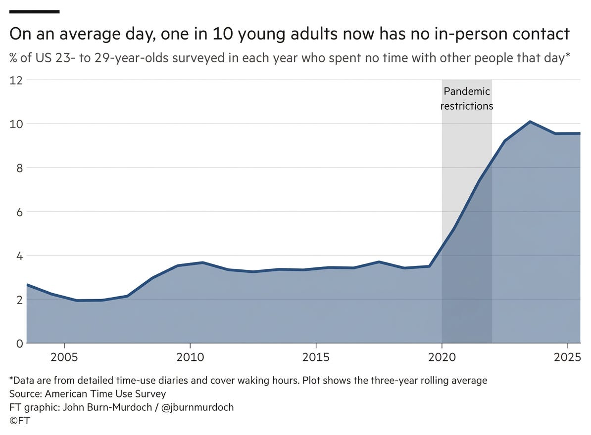
CHART 1 • Young Americans’ social lives didn’t recover after Covid
This chart isn’t about loneliness, but rather something simpler than that. In some ways, it’s more striking. Young adults in America can spend an entire waking day without physically being with another person.
Before the pandemic, that was unusual. Only around 3.5% of Americans aged between 23 and 29 reported a completely contact-free day.
Then Covid arrived and that number jumped. That part is unsurprising, because workplaces were closed, social events disappeared, and people stayed at home.
However, what is surprising is what happened afterwards. By 2023, around 10% of young adults were still spending whole days without in-person contact. In 2025, this figure remained at around 9.6%, almost three times the pre-pandemic level.
Source: Financial Times
Remote work appears to explain part of this. Research suggests that Americans who can work remotely spend roughly an extra waking hour alone on working days and socialise less afterwards. But remote work explains only part of the broader shift.
This is what makes this chart so interesting. Society may have reopened, but young adults did not completely return to their old social routines.
Paid subscribers get access to the other four charts: German migration, paid holiday, car theft and language families. Together, they show how legal rights, recorded events and inherited identities change meaning when definitions and denominators move.
