
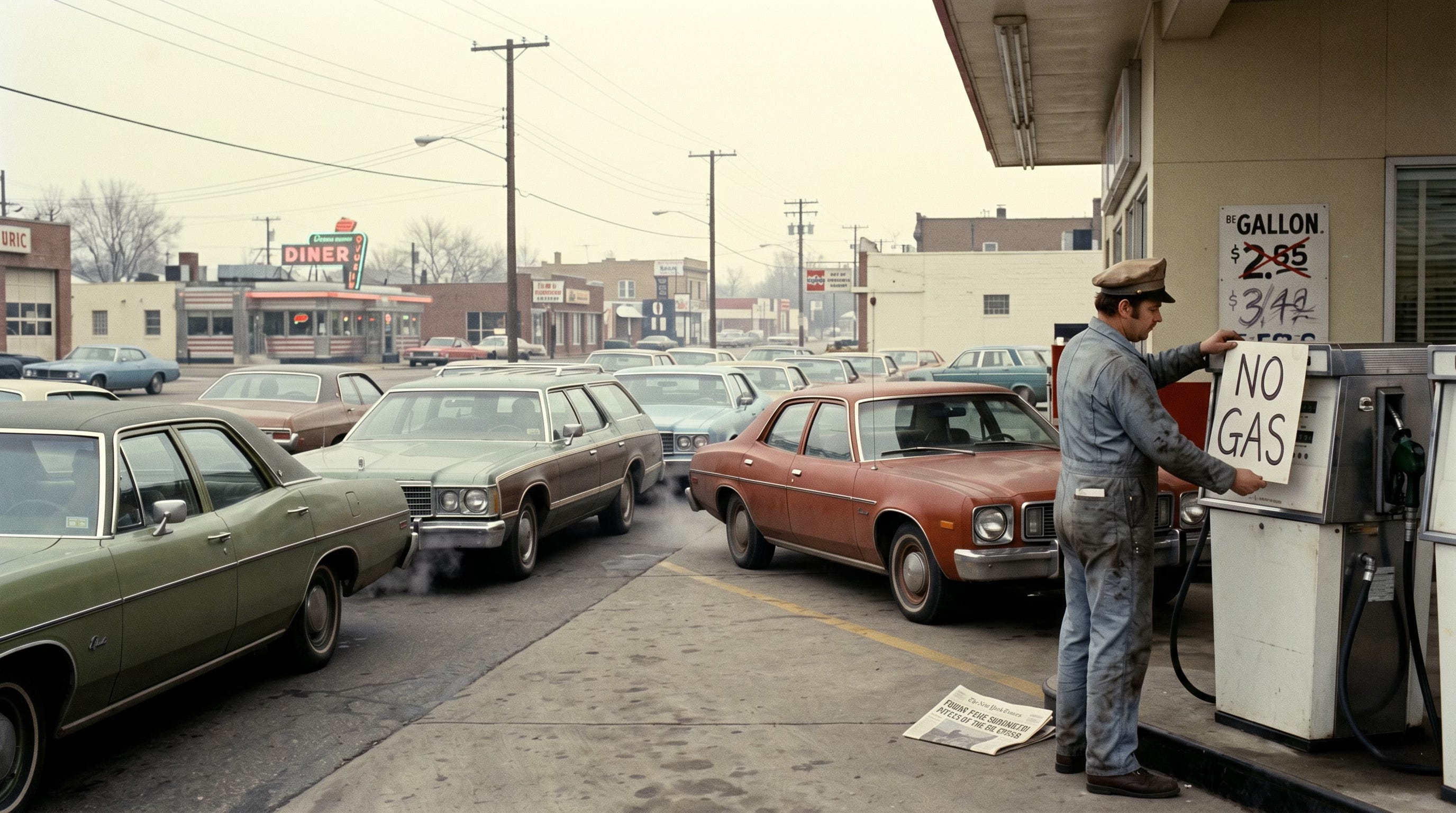
Why the 1970s oil shocks changed the world economy
Five charts to start your day

For $10 a month, or $100 a year, you support a simple mission: spread great data visualisation wherever it comes from. You help fund the work of finding, sourcing and explaining the charts that deserve a wider audience. And you back a publication built on generosity, transparency and the belief that better understanding makes a better world.CHART 1 • Why the 1970s oil shocks changed the world economy
The most important line here is the break in fossil fuel demand after the oil shocks of the 1970s. Before then, economic growth and fossil fuel consumption moved together. After the embargo and the Iranian Revolution, that link weakened sharply. The world did not stop growing. It became less dependent on burning ever more fossil fuel to do it.
That shift helps explain why modern energy shocks do not land in quite the same way. The old oil economy responded by becoming more efficient, using less oil in power generation and pushing more activity onto electricity. Since 1973, global GDP and electricity use have both risen far faster than fossil fuel demand.
The wider implication is that energy transitions often begin not with idealism but with crisis. The shocks of the 1970s forced economies to rewire themselves. Today’s disruptions may do something similar again by accelerating the move towards an economy where electricity matters more and fossil fuels matter less.
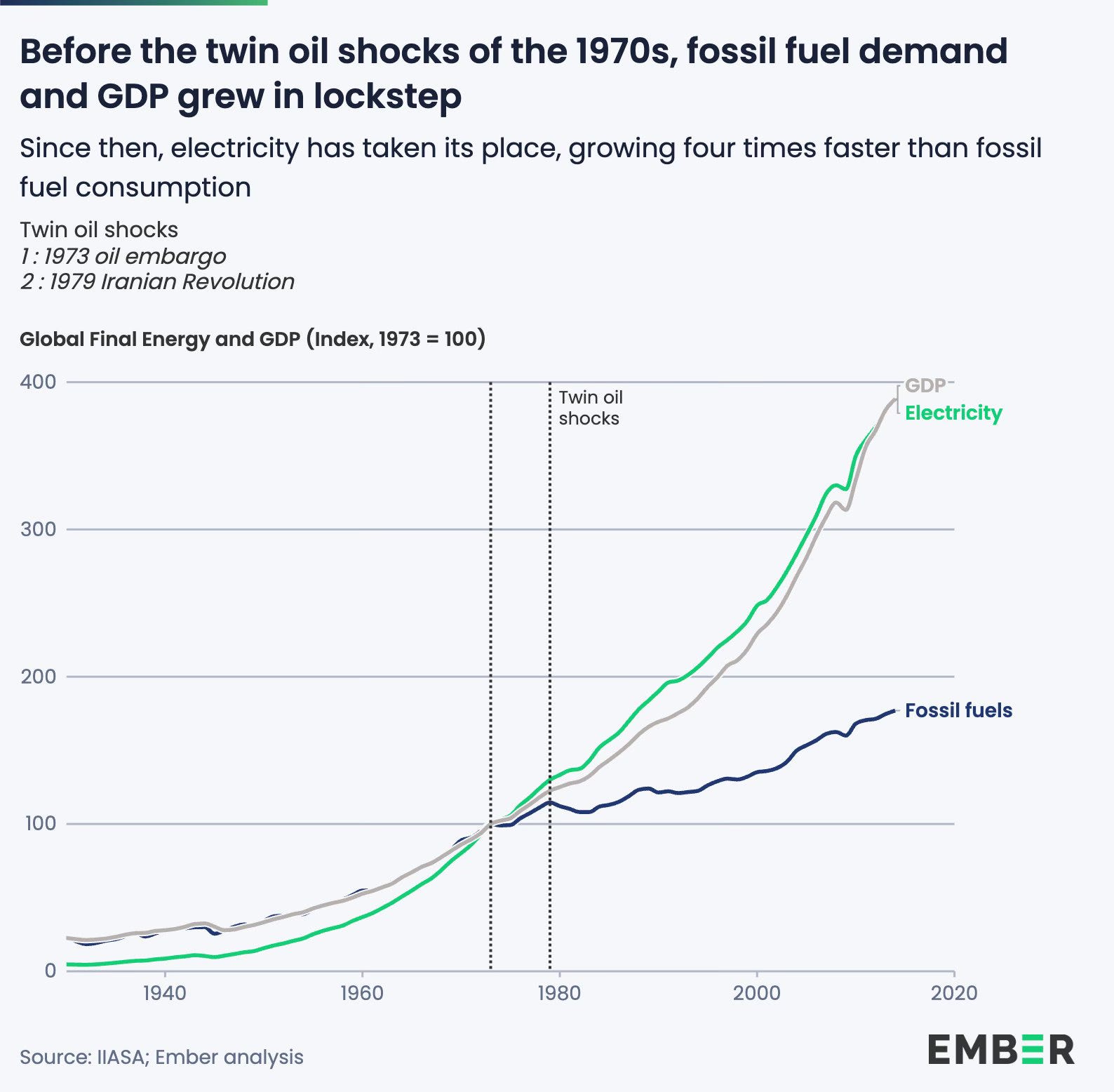
Source: Ember
Big economic changes only become possible once the old model becomes too painful to defend. Countries rarely move because they have seen the light. They move when the cost of standing still starts to feel dangerous, whether that means oil shocks, geopolitical dependence or voters no longer willing to absorb another energy crisis.
That is why energy is such an important subject to watch now. It tells you a great deal about how states think, how much they are prepared to spend and whether they are building genuine resilience or merely buying time.
I’ve got four more charts that expand on this story, but they’re for paid subscribers. Consider joining if you want the full edition.
