
Why clean power is winning on cost
Five charts to start your day

For $10 a month, or $100 a year, you support a simple mission: spread great data visualisation wherever it comes from. You help fund the work of finding, sourcing and explaining the charts that deserve a wider audience. And you back a publication built on generosity, transparency and the belief that better understanding makes a better world.CHART 1 • Why clean power is winning on cost
The most important thing in this chart is not that solar and onshore wind are cheap. We have known that story for a while. What stands out now is how broad the shift has become. Battery storage has fallen sharply in cost and now sits close to coal, while solar and onshore wind remain comfortably below both coal and gas. This no longer looks like a niche green premium. It looks much more like a changing economic base.
That matters because energy debates are still often framed as if clean power is mainly a political or environmental choice. Charts like this suggest something more awkward for that argument. In many cases, the market is already doing the choosing. If the cheapest new electricity increasingly comes from solar, wind and, now, more competitive storage, then the real question is not whether the transition makes economic sense. It is how quickly grids, permitting systems and infrastructure can catch up.
The more interesting tension is what happens next. Cheaper generation does not automatically mean cheaper power bills, because networks, backup capacity and system reliability still matter enormously. But the direction of travel is hard to miss. Fossil fuels used to defend their position on price. That defence is looking weaker with each passing year.
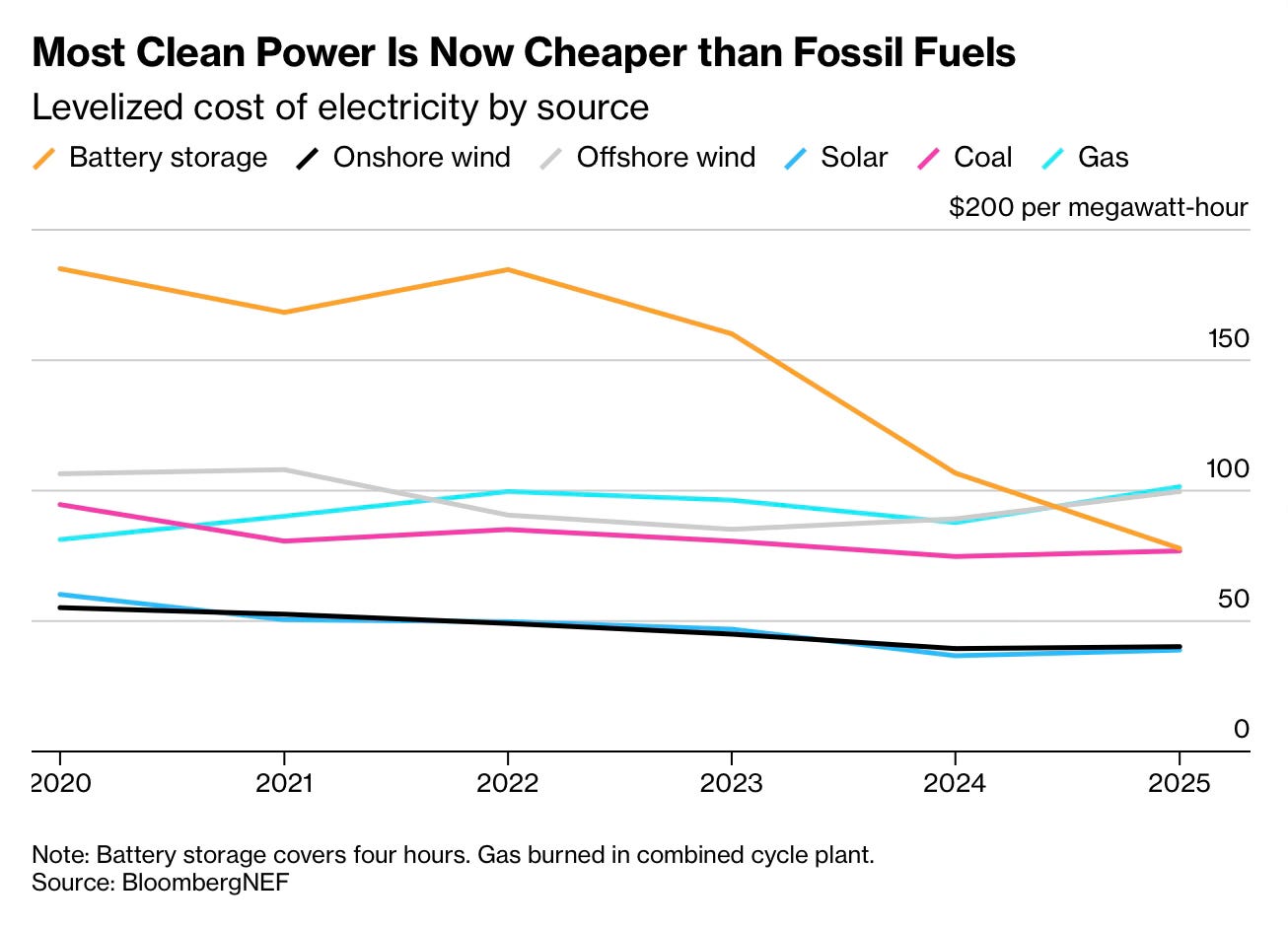
Source: Bloomberg
What stays with me after looking at this set of charts is how often energy debates drift into fantasy. One side talks as if the transition can be willed into existence by good intentions alone. The other talks as if the old system can hold indefinitely. Neither view survives contact with the numbers. Energy transitions are physical, expensive and slow, but they are also shaped by cost curves that can move much faster than politics expects.
There is something deeper here too. Every advanced society depends on a quiet foundation of reliable power, and most people only notice it when that foundation starts to strain. The real test is not whether countries can announce bold emission targets. It is whether they can build an energy system sturdy enough to support rising living standards without pretending trade offs do not exist. Sorry if that’s blunt. But that is what data tells us.
I’ve got four more charts that expand on this story, but they’re for paid subscribers. Consider joining if you want the full edition.
