
Who is funding the Ukraine war effort
Five charts to start your day

For $10 a month, or $100 a year, you support a simple mission: spread great data visualisation wherever it comes from. You help fund the work of finding, sourcing and explaining the charts that deserve a wider audience. And you back a publication built on generosity, transparency and the belief that better understanding makes a better world.
Power rarely shifts with a single announcement. It drifts, accumulates, then suddenly feels obvious in hindsight.
These five charts are about that slow accumulation. Military funding shaped by politics rather than strategy. Trade barriers that were meant to be temporary but have settled in. Central bank leadership expectations influencing markets before anyone is appointed. Growth happening somewhere else while attention stays at home. Capital flowing in one dominant direction because trust still has a centre.
CHART 1 • Who is funding the Ukraine war effort
This chart tracks military aid commitments over time and shows a clear pattern.
The United States remains the single largest donor, with large spikes tied to congressional approval cycles. Europe collectively matches or exceeds US support in many periods, though contributions are spread across countries and institutions. Other donors add smaller but persistent amounts.
What stands out is volatility. Aid flows are not smooth. They depend on politics, budgets and public support. That creates uncertainty for Ukraine’s planning and procurement, even when headline totals look large.
The composition of aid also matters. Financial support, equipment and ammunition are not interchangeable in the short term.
As the conflict drags on, sustaining predictable support may be as important as total sums committed.
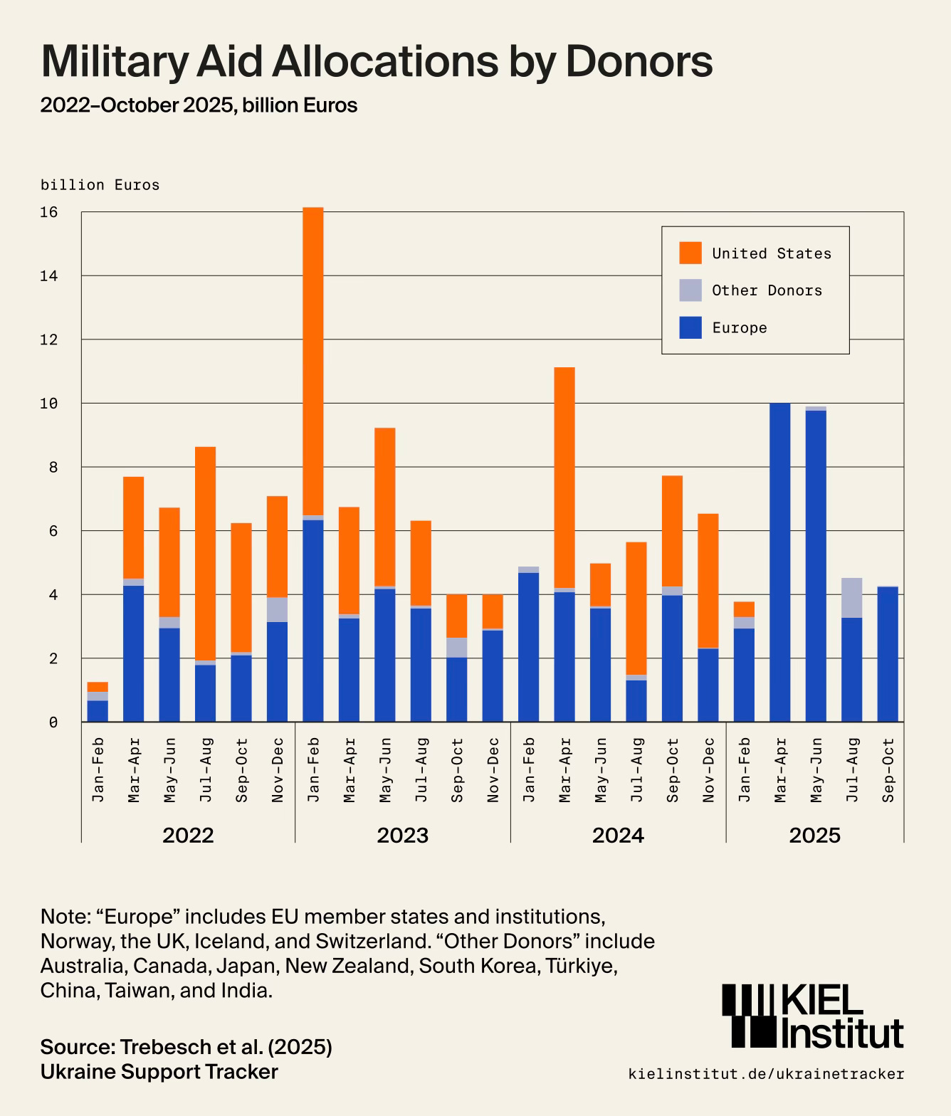
Source: Kiel Institut
We adapt quickly to new baselines, especially when change happens incrementally. But systems built on trust, credibility and cooperation tend to fray at the edges long before they break.
I have four more charts that extend this story and look at where these pressures may surface next. They are for paid subscribers. Consider joining if you want the full edition.
