


For $10 a month, or $100 a year, you support a simple mission: spread great data visualisation wherever it comes from. You help fund the work of finding, sourcing and explaining the charts that deserve a wider audience. And you back a publication built on generosity, transparency and the belief that better understanding makes a better world.
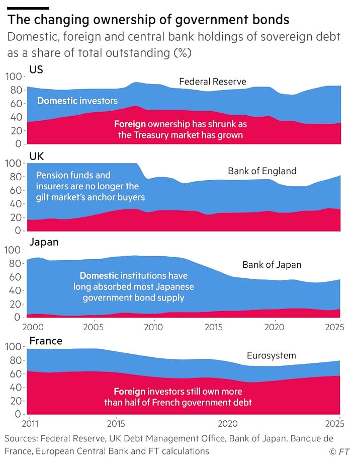
CHART 1 • When central banks stop buying, who picks up the bonds?
Central banks spent years making life easier for governments by buying their bonds. Now those holdings are shrinking, and somebody else must supply the money. I think that “somebody” is the entire story. If private investors are less willing than central banks were, governments will have to offer them higher interest payments.
The four countries in this chart from the Financial Times do not have the same replacement buyer. France still relies heavily on investors abroad. Japan relies overwhelmingly on domestic institutions and its central bank. Britain has lost much of the dependable demand once provided by pension funds and insurers, while America’s bond market has expanded faster than foreign ownership.
Source: Financial Times
You might hear this discussed as the end of quantitative easing, which makes it sound like central-bank housekeeping. It is really a refinancing problem for governments and, eventually, taxpayers. The comparisons are not perfectly harmonised, but they make one thing clear: each country must persuade a different group to absorb its debt, and those buyers get to name their price.
Paid subscribers get access to the other four charts: Britain’s bank taxes, China’s giant banks, India’s growth relative to China and Indian sector returns. Together, they show how capital moves through tax systems, bank balance sheets and markets with sharply different exposures.
