What the data says about the US-Iran war
Special report
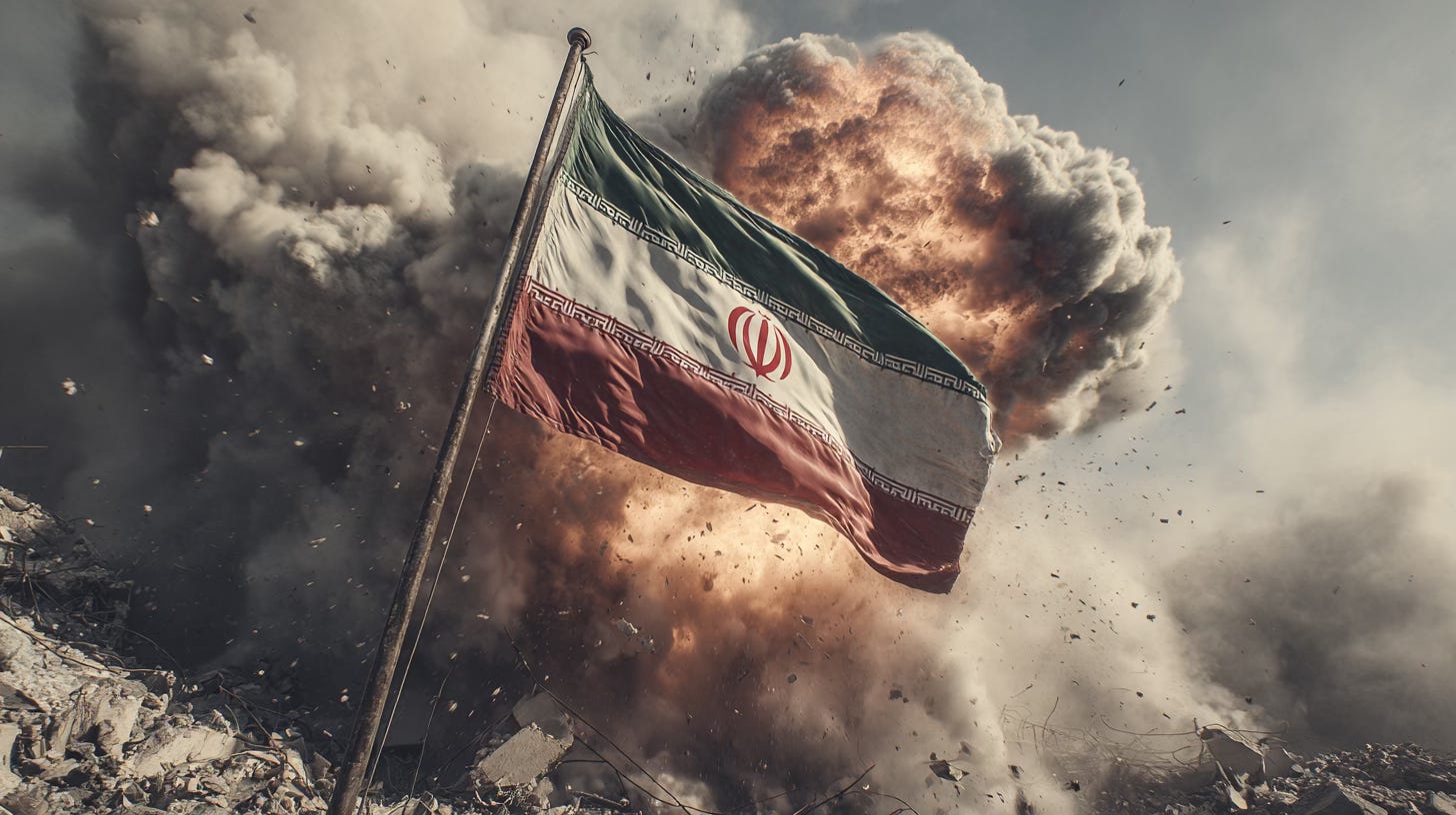
This is a special report on the war in the Middle East, which I have made free to view. The charts below are the ones I found most interesting in trying to understand the conflict. If you would like to receive the most interesting chart I see each day, consider subscribing.
If you want to understand what is happening in the Middle East right now, you have to stop listening to the language of war and start looking at what the system is doing. Governments speak in abstractions because abstractions give them room to manoeuvre. “Deterrence”. “De-escalation”. “Proportionality”. These words are designed to calm people down, not to tell the truth.
The reality is simpler and uglier. The United States is involved. Iran is involved. Israel is involved. And several other countries are involved whether they want to be or not.
This is already bigger than a bilateral fight. The charts make that clear because they capture the parts of the story that officials prefer not to dwell on. Public consent. Accumulated trauma. Trade relationships that do not match political slogans. And a global energy system that depends on one spectacularly fragile choke point.
So rather than lecture you, I am simply going to show you the charts and let the data speak. Interpret them yourself. Draw your own conclusions.
Let’s get into it.
CHART 1 • Support for striking Iran is far weaker than previous wars
Source: Strength in Numbers
CHART 2 • The human cost of the Iraq war
Source: Iraq Body Count
CHART 3 • Countries bombed by the United States since 2001
Source: Al Jazeera
CHART 4 • The Strait of Hormuz sits at the centre of global energy flows
Source: Info in Data
CHART 5 • Brazil is one of the largest exporter to Iran
Source: Latinometrics
CHART 6 • Oil flowing through the Strait of Hormuz
Source: Jack Prandelli
CHART 7 • Military spending is rising across the world
Source: The Data of Everything
CHART 8 • Nuclear infrastructure across the Middle East
Source: Info in data
CHART 9• Qatar’s LNG exports are critical to global gas markets
Source: Info in data
CHART 10 • Qatar is becoming more important to global gas supply
Source: S&P Global
CHART 11 • Shipping through the Strait of Hormuz is thinning
Source: Financial Times
CHART 12 • Markets react immediately when Middle East tensions rise
Source: Wall Street Journal
CHART 13 • Tanker traffic through the Strait of Hormuz collapses
Source: Economist


