
What America's buyback bonanza tells us
Five charts to start your day


I remember when I was at Fidelity back in 2011, my boss asked me to write about dividends versus buybacks. In the UK, just like in the rest of Europe, buybacks were traditionally uncommon. They are more popular these days. At the time I was flummoxed. Why did he want me to study this peculiarly American phenomenon.
The main criticism I had was that companies love buybacks when times are good but slash them when things turn sour. Dividends are rarely cut because everyone knows what signal that sends. And also, if times are good, doesn't it make more sense to put a bit aside for research and development?
CHART 1 • What America's buyback bonanza tells us
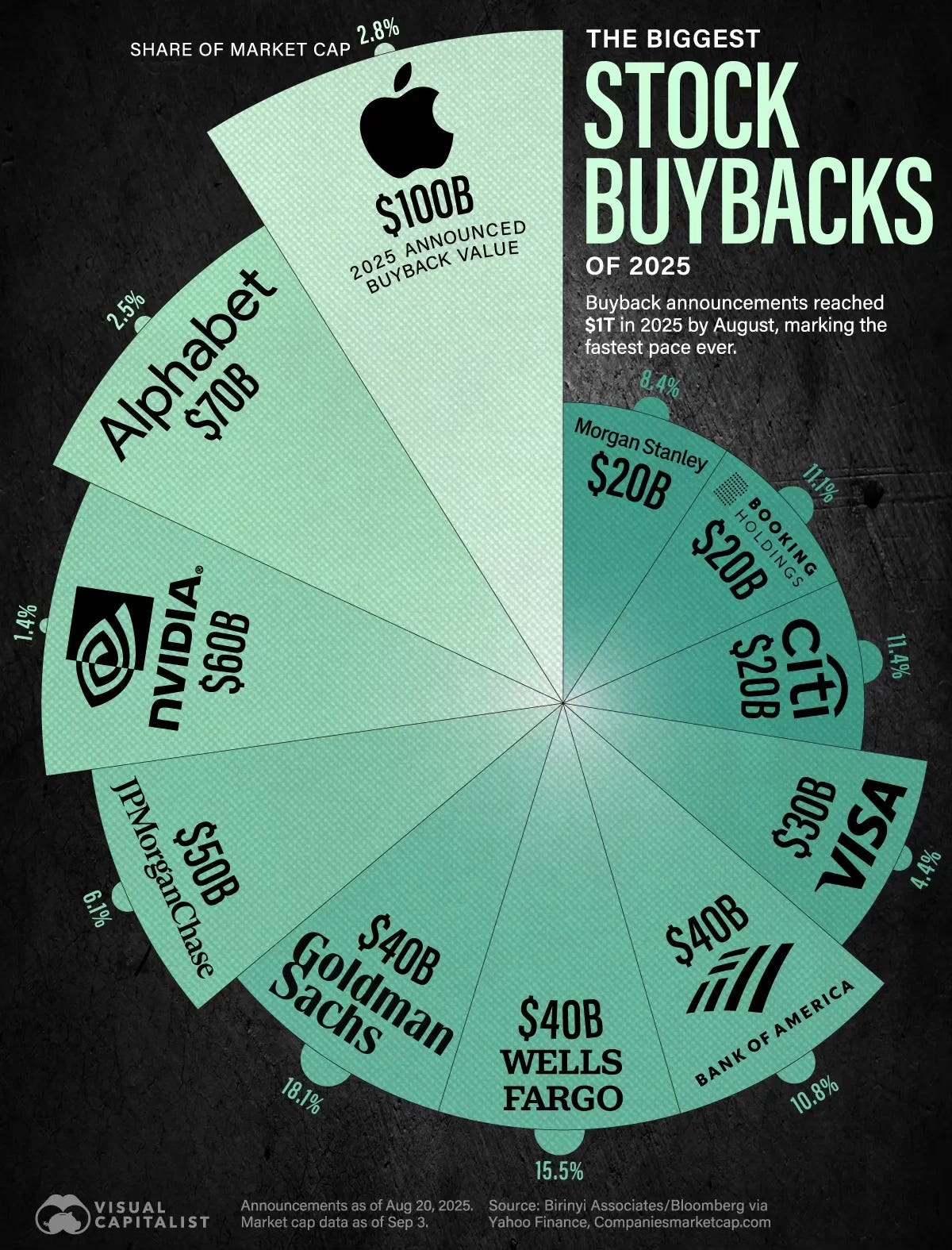
Looking at Visual Capitalist's chart here shows that $1 trillion in announced buybacks have been made year-to-date (August 2025). Apple leads with $100 billion, followed by Alphabet at $70 billion and Nvidia at $60 billion. These are eye-watering numbers.
Ten companies account for half the total. JPMorgan Chase, Goldman Sachs, Wells Fargo and their banking peers are promising over $200 billion collectively. So is this corporate America announcing it has more cash than ideas? That's a bit worrying.
What troubles me isn't the buybacks but what they represent. Georgetown's Rush Doshi observes that while American firms buy back shares, "competitors in China don't do buybacks. They invest."
Perhaps that's the real story. American capitalism excels at generating wealth but sometimes lacks the patience to invest it wisely. In their haste to return cash today, are these companies mortgaging America's competitive future for this quarter's stock price?
Source: Visual Capitalist
Now I have to say, I do love this data visualisation, but I also hate it in equal measure. Visual Capitalist tends to have a tendency to engage in a bit of chart junk, and in some cases like here data distortion. It would probably have been better off as a bar chart. But it is a forgivable offence in my opinion because it is beautiful.
I've long argued that data visualisation is not just about accuracy (although this is very important, especially in the fight against data manipulation). It is also a form of human expression, a way to tell stories and a way to remain human. We are visual, emotional beings and we need to express ourselves with data in an age of AI.
Anyway, those are my thoughts for the day on this particular topic. You don't have to agree with me, but that's how I feel. I have four more charts to share with you today, but you will have to be a paid subscriber to see them. Go on! It's worth it. Let me take you down some new rabbit holes.
