
What Americans die from and what the media talks about
Five charts to start your day


Quick note — Killer Charts has been $8/month and $80/year since launch two years ago. From 1 December the price for new subscribers will rise to $10/month and $100/year. If you’ve been meaning to upgrade, you can lock in the old rate for life here.CHART 1 • What Americans die from and what the media talks about
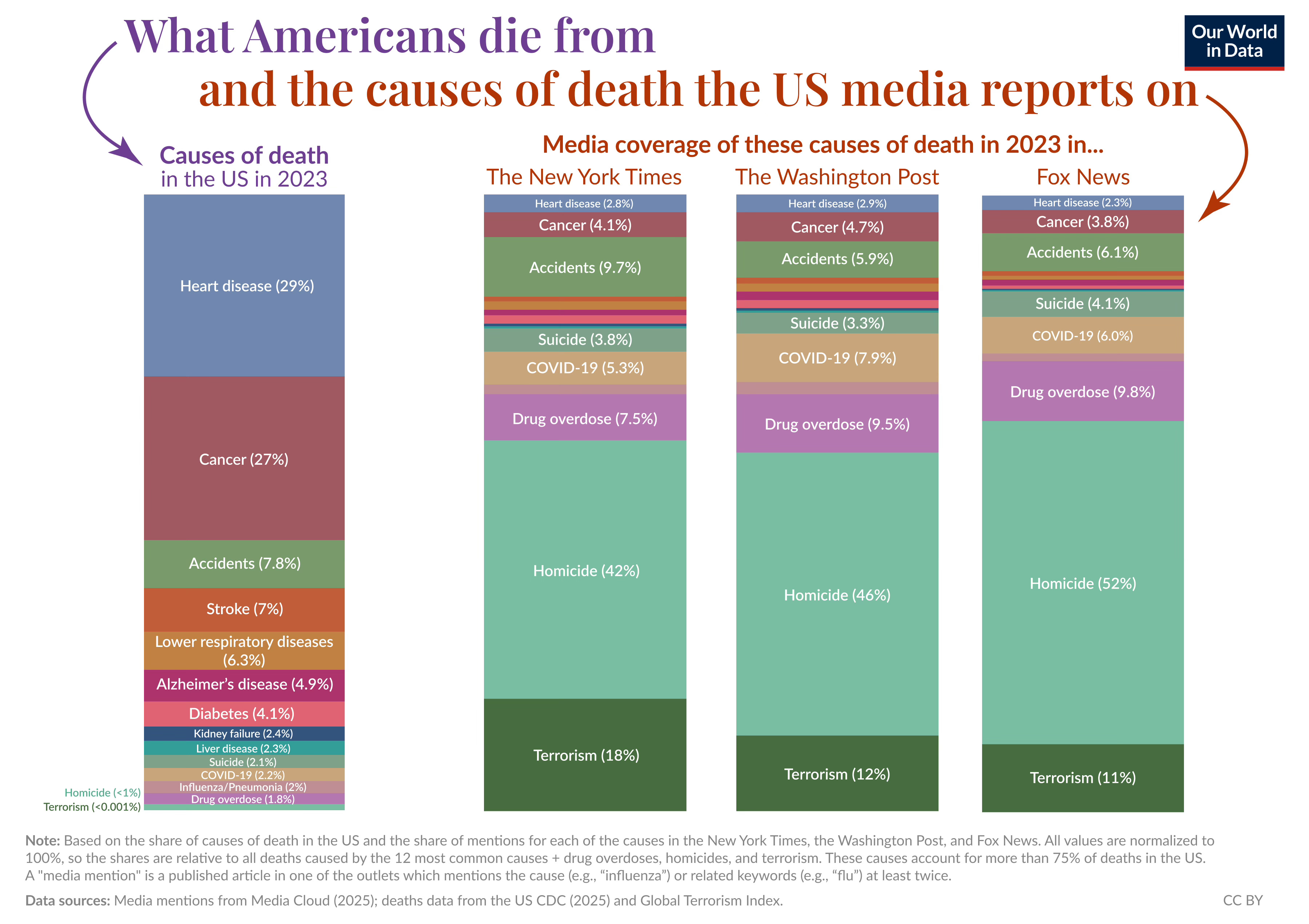
Americans are far more likely to die from heart disease and cancer than anything else. You would not know it from watching the news. Together these two causes account for more than half of all US deaths, yet they barely register in media coverage. The headlines are dominated instead by rare events such as homicide and terrorism.
This chart from Our World in Data compares what Americans actually die from with how often those causes appear in major outlets like The New York Times, The Washington Post and Fox News. Homicide is responsible for less than 1% of deaths but takes up more than 40% of related news stories. Terrorism causes a tiny fraction of fatalities yet can command up to 18% of the coverage. The pattern reflects how news values and audience psychology distort risk. Dramatic and frightening stories are given far more weight than dull, everyday killers.
If media attention better matched the real causes of death, would voters, health systems and policymakers focus their energy in different places?
Source: Our World In Data
What concerns me most about this chart is how thoroughly it exposes our blind spots. If the media lens were closer to the real causes of death, it is hard to believe that voters and policymakers would make the same choices. We might see more serious debate about prevention, lifestyle, public health and long horizon investment rather than constant firefighting of the latest shock.
There is a human lesson in that. We are drawn to what is vivid rather than what is likely. We mistake noise for signal and let fear steer our priorities. The data is a quiet invitation to look again at where we place our attention and what we choose to ignore.
I have four more charts to share with you, but they are for paid subscribers. Consider joining if you would like the full edition.
