


For $10 a month, or $100 a year, you support a simple mission: spread great data visualisation wherever it comes from. You help fund the work of finding, sourcing and explaining the charts that deserve a wider audience. And you back a publication built on generosity, transparency and the belief that better understanding makes a better world.
CHART 1 • US under-40 households cannot keep up with home prices
Young US households are not just facing expensive homes. They are facing expensive homes with less time, less income room and more expensive debt than earlier buyers.
National median home prices have risen far ahead of median income for households headed by under-40 adults in the United States. The young household price-to-income ratio reached 3.5 in 2024, close to the mid-2000s bubble peak.
The comparison is imperfect because mortgage rates change the monthly burden. But the direction is hard to soften. Many young buyers are paying more for the house and more for the financing, while time works against them.
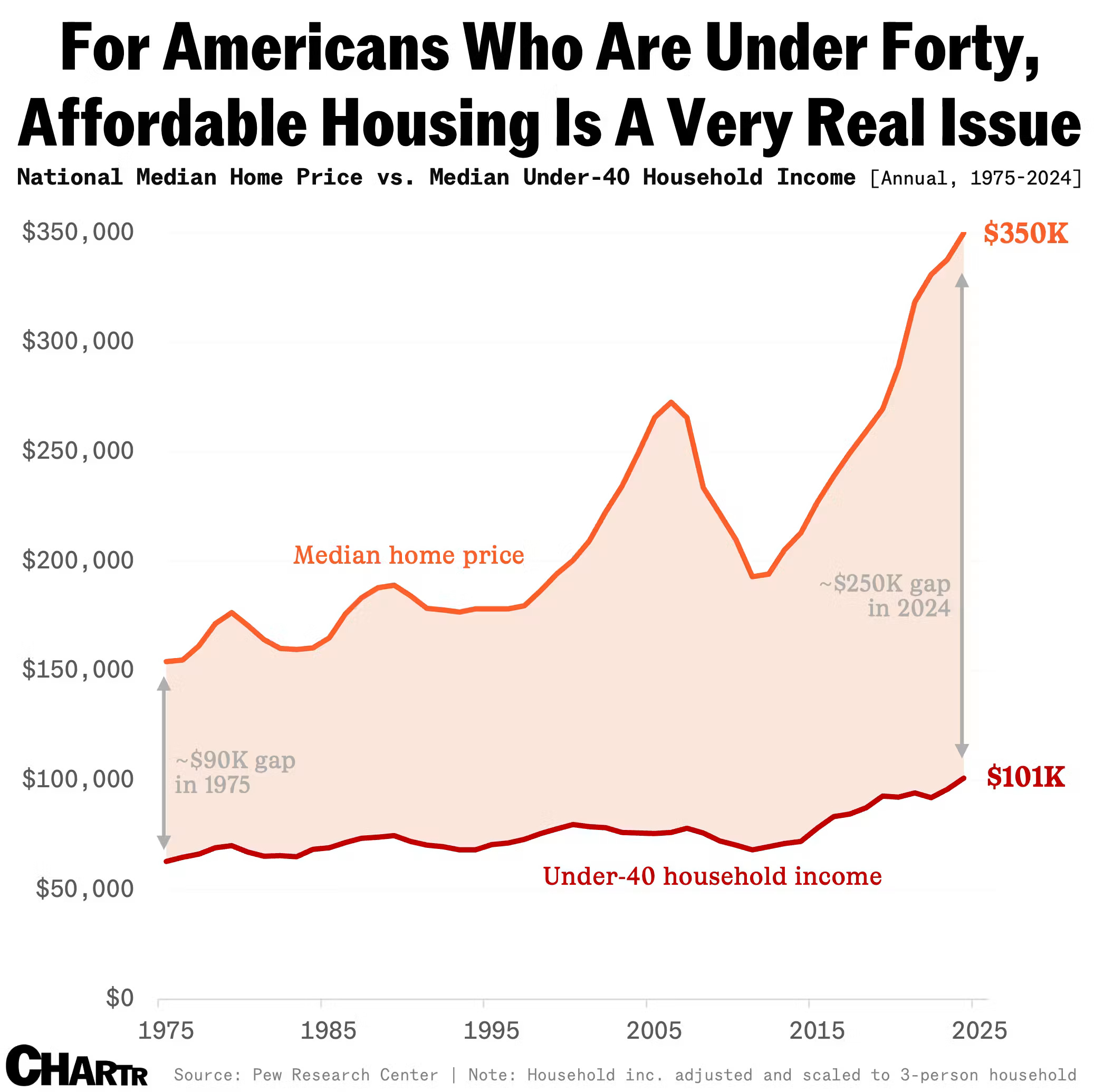
Source: Chartr
The housing chart is hard to talk around. The problem is not a bad quarter or a local frenzy; it is the gap between prices, income, financing costs and time.
Paid subscribers get access to the other four charts: the salary needed for US rent, divorce rates by job, height differences in couples and Monopoly’s grip on American board-game memory. Together, they show how money, work and habit shape ordinary life.
