

For $10 a month, or $100 a year, you support a simple mission: spread great data visualisation wherever it comes from. You help fund the work of finding, sourcing and explaining the charts that deserve a wider audience. And you back a publication built on generosity, transparency and the belief that better understanding makes a better world.
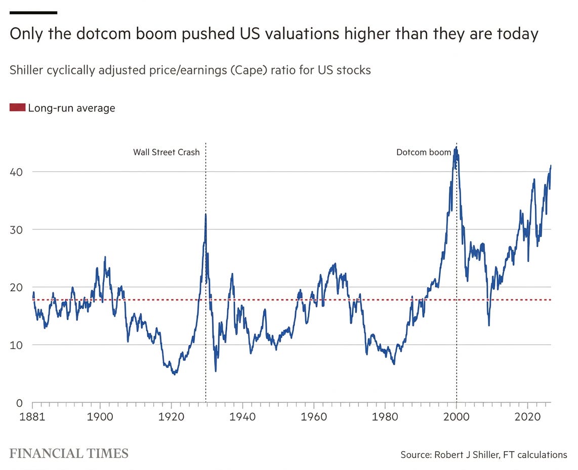
CHART 1 • US stocks trade near highest valuations in history
US stocks are trading at some of the highest valuations experienced in history. What you see here is the CAPE ratio, which compares share prices with the previous 10 years of inflation-adjusted earnings. Today, it stands at roughly 41 times earnings, which is more than twice its long-term average of around 18 and only slightly below the dotcom peak of 44.
However, this doesn’t mean another crash is about to happen. US stocks have remained expensive for much of the past decade, supported by strong earnings growth and extraordinary profits from some of the country’s largest technology companies.
Source: Financial Times
The problem is that investors are already paying an enormous amount for this success. At these valuations, companies need to keep delivering exceptional results. That leaves the market with much less room for disappointment. Slower earnings growth, weaker returns on AI investment or persistently high interest rates could all cause investors to question whether today’s valuations are justified.
Paid subscribers get access to the other four charts: Treasury yields, inflation-adjusted market recoveries, value stocks and yen intervention. Together, they show why price, patience and policy must be judged in the same frame.
