


For $10 a month, or $100 a year, you support a simple mission: spread great data visualisation wherever it comes from. You help fund the work of finding, sourcing and explaining the charts that deserve a wider audience. And you back a publication built on generosity, transparency and the belief that better understanding makes a better world.
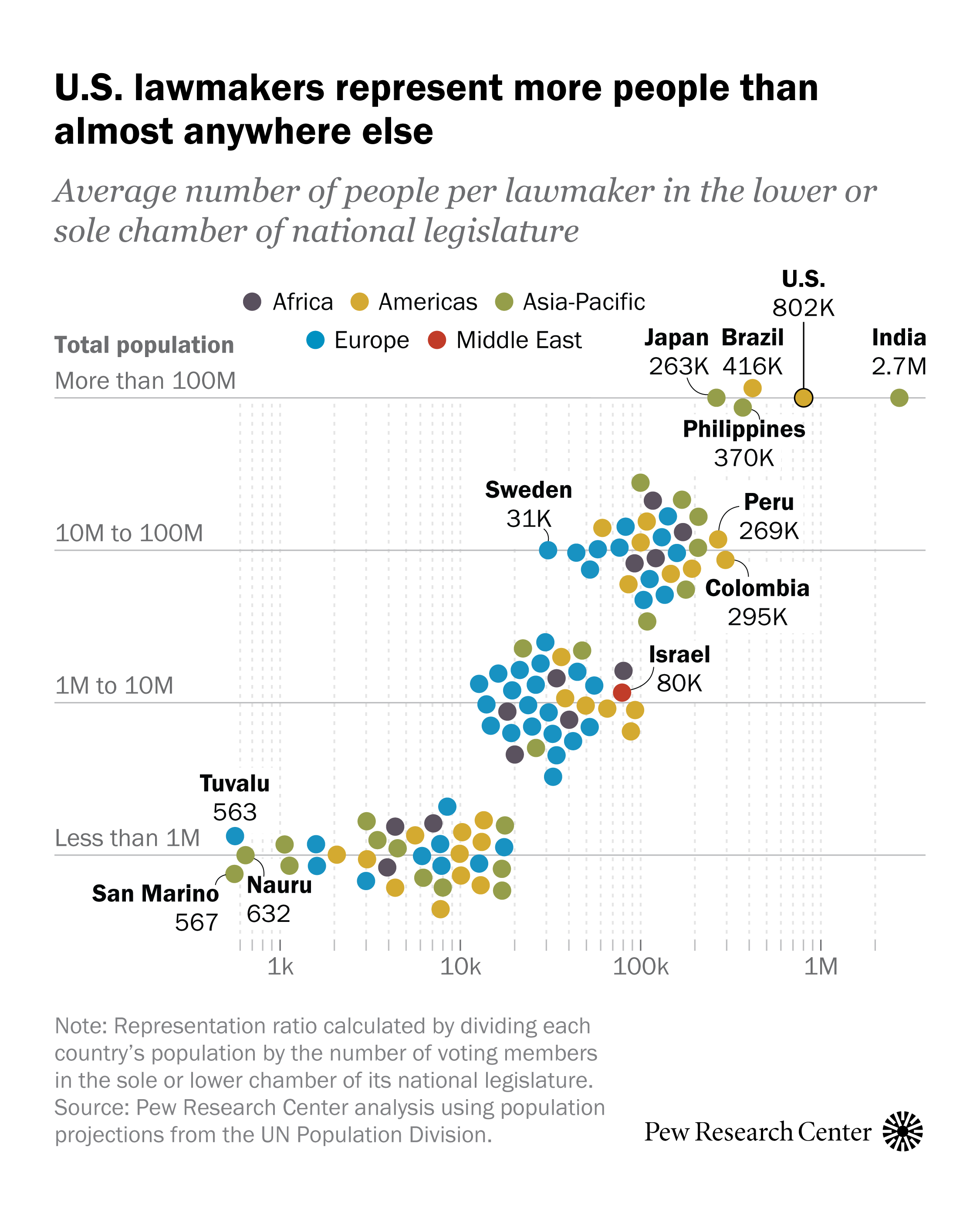
CHART 1 • US lawmakers represent more people than almost anywhere else
Representation is partly a numbers problem. The more people each lawmaker represents, the harder it is for politics to feel personal or responsive.
Pew’s comparison puts the US House at roughly 800,000 people per representative, far above most countries in this comparison. Only India is in a larger category among the highlighted examples.
No chart can tell you the right size for a chamber. It can show why American voters feel remote from Congress. One elected official is being asked to stand in for a very large public, which affects casework, campaigning and the basic sense that a representative can know the people they represent.
Source: Pew Research Center
Representation is usually argued through parties and ideology. The cleaner starting point is arithmetic: how many people is one politician meant to know, understand and speak for?
Paid subscribers get access to the other four charts: the UK’s social-rental stock, OECD immigration growth, Chinese real estate prices and global working hours. Together, they show how housing, migration, property wealth and work can strain institutions that once looked adequate.
