
US corporate profits are increasingly a tech story
Five charts to start your day


For $10 a month, or $100 a year, you support a simple mission: spread great data visualisation wherever it comes from. You help fund the work of finding, sourcing and explaining the charts that deserve a wider audience. And you back a publication built on generosity, transparency and the belief that better understanding makes a better world.
Corporate profitability still looks strong at the headline level. But dig a little deeper and a very specific pattern emerges. The gains are real, yet they are far from evenly shared.
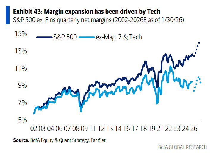
CHART 1 • US corporate profits are increasingly a tech story
Aggregate profit margins can hide as much as they reveal. This chart separates what is really driving them.
Since the early 2000s, net margins for the S&P 500 have trended steadily higher. But when technology and the largest platform companies are stripped out, the picture changes. Margins outside tech have risen far more modestly and remain significantly lower.
The implication is concentration. A growing share of overall profit growth is being generated by a relatively small group of highly scalable firms with strong pricing power, low marginal costs and global reach. Cloud computing, software and digital platforms allow revenue to grow much faster than costs.
By contrast, margins in traditional sectors remain constrained by labour costs, capital intensity and competition. They benefit from cycles, but they do not compound in the same way.
This matters for investors and policymakers alike. Index level profitability increasingly reflects sector mix rather than broad based efficiency gains across the economy. When profits are driven by fewer firms, economic resilience becomes more uneven.
Source: Mike Zaccardi
One of the defining features of this market is how quietly concentration has taken hold. Index returns look broad. Profit generation is not. That gap matters because it shapes resilience, valuation and risk in ways that are easy to overlook.
I have four more charts that build on this theme and explore where concentration is increasing and where it may start to matter more for investors. They are for paid subscribers. If you want the full edition and the deeper context behind it, consider joining.
