


For $10 a month, or $100 a year, you support a simple mission: spread great data visualisation wherever it comes from. You help fund the work of finding, sourcing and explaining the charts that deserve a wider audience. And you back a publication built on generosity, transparency and the belief that better understanding makes a better world.
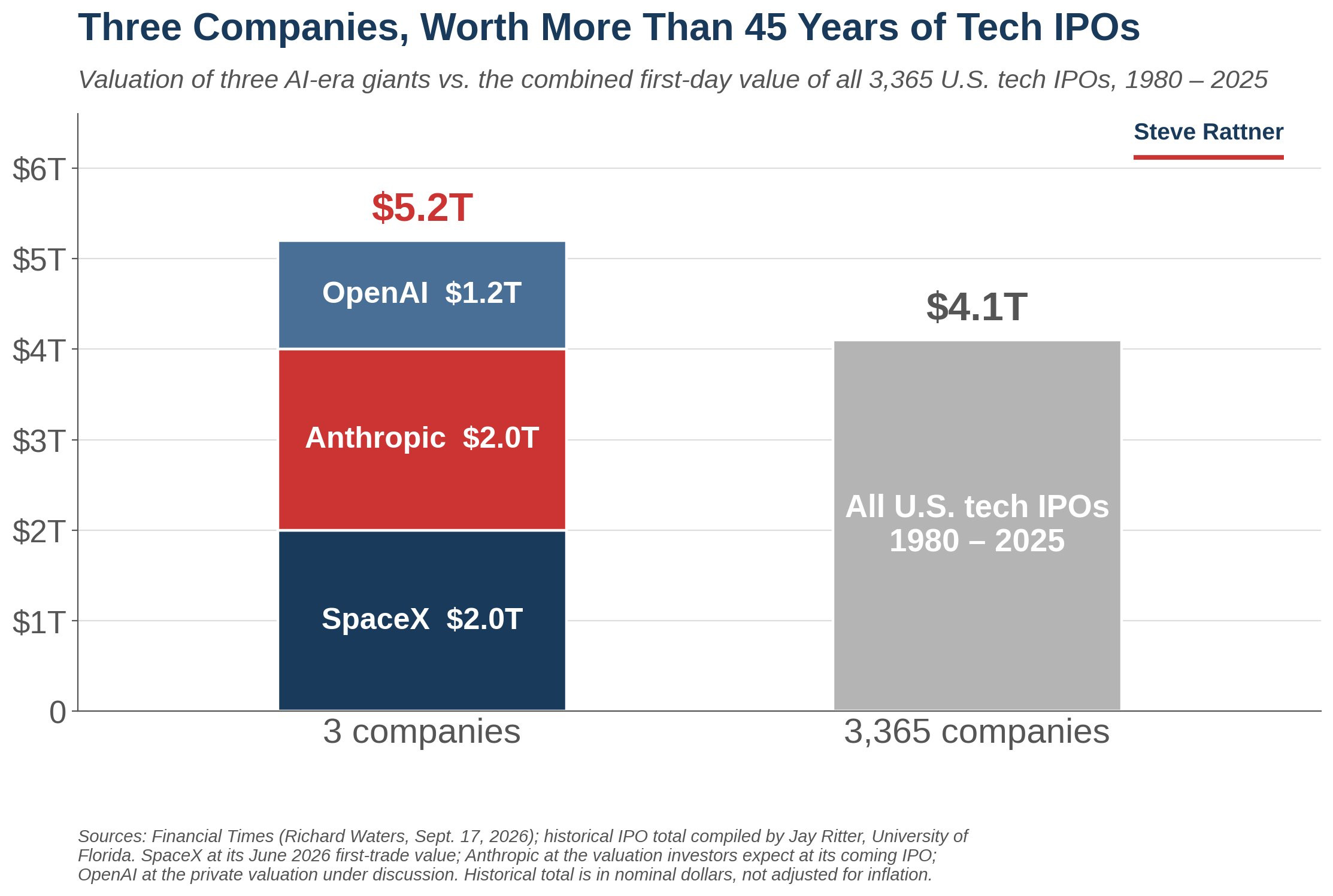
CHART 1 • Three companies worth more than 46 IPOs
This is one of those shock-and-awe charts. You look at this and you go, wow, that’s insane. How can this be possible? Surely there is an AI bubble in the making! But at the same time, it’s not beyond plausibility.
We have to remember that these three companies have really disrupted the world in many ways, especially OpenAI and Anthropic. With natural language models becoming commonplace in everyday life, at work and at home, AI is now firmly rooted in the way that we live.
SpaceX also comes into that, but perhaps not as explicitly. It has disrupted the space industry with huge numbers of successful rocket launches and the emergence of Starlink, which has changed the space industry tremendously.
Source: Steve Rattner
However, there are some issues with this chart. The most obvious is that the valuations of OpenAI, Anthropic and SpaceX are not like-for-like. SpaceX’s value has come from public trading, while Anthropic’s valuation is based on an expected IPO. Meanwhile, OpenAI’s valuation used here comes from private valuations that are currently under discussion.
It’s nonetheless impressive. The question is whether these three businesses can generate enough lasting profit to justify carrying a combined market valuation greater than 46 years of US technology IPOs.
Paid subscribers get access to the other four charts: Big Tech’s commitments, the split AI IPO race, leveraged memory bets and SanDisk’s margin. Together, they show how capital, scarcity and market structure divide AI’s winners from its risks.
