
There is always a reason investors sell
Five charts to start your day


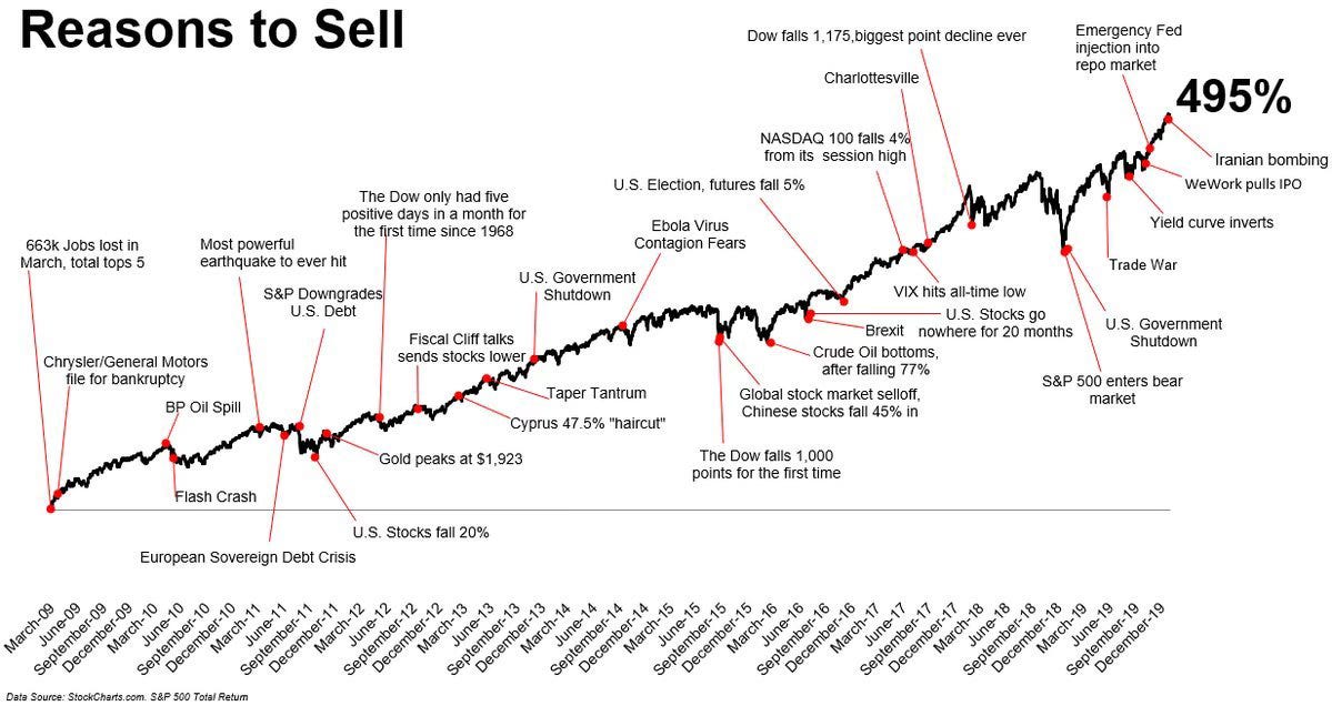
For $10 a month, or $100 a year, you support a simple mission: spread great data visualisation wherever it comes from. You help fund the work of finding, sourcing and explaining the charts that deserve a wider audience. And you back a publication built on generosity, transparency and the belief that better understanding makes a better world.CHART 1 • There is always a reason investors sell
The chart is crowded with red dots. Each marks a moment that felt decisive at the time. Bankruptcies. Downgrades. Sovereign crises. Government shutdowns. Flash crashes. Trade wars. Ebola. Brexit. Oil collapses. Record point declines.
Each headline carried urgency. Each felt like a turning point.
And yet the line moves steadily upward.
From the financial crisis trough in 2009 to the end of the decade, the S&P 500 delivered nearly 500% in total return. The interruptions are visible. They are also temporary. The market absorbed each shock, paused, corrected and resumed.
What the chart captures is not complacency. It is resilience. Markets discount risk continuously. What feels unprecedented in the moment tends to fade into the longer trend.
That does not mean the risks were imaginary. Many events listed were serious. Some triggered sharp drawdowns. But few altered the structural trajectory of earnings, liquidity and growth.
The lesson is not that bad news does not matter. It is that markets are forward-looking and adaptive. By the time fear is loudest, prices have often already adjusted. The scariest moment to stay invested is rarely the right moment to leave.
Source: StockCharts.com
The stock market crises have been relentless since the Financial Crisis. Downgrades, pandemics, wars and flash crashes, where each arrives with urgency. Each feels definitive. Yet over the past decade and a half, the S&P 500 has marched steadily higher, interruptions and all. The red dots look dramatic in isolation. In aggregate, they barely dent the trend. Will that continue… who knows!
I have four more charts that dig deeper into where that resilience is strongest and where the next exits may occur. They are for paid subscribers. Consider joining if you want the full edition and a clearer view of how this cycle is really evolving.
