


For $10 a month, or $100 a year, you support a simple mission: spread great data visualisation wherever it comes from. You help fund the work of finding, sourcing and explaining the charts that deserve a wider audience. And you back a publication built on generosity, transparency and the belief that better understanding makes a better world.
CHART 1 • The world is running out of babies
Demographic decline is no longer a rich-world eccentricity. UN data gathered by Our World in Data shows fertility below replacement across much of Europe, North America, East Asia and Latin America. The US, UK and France sit around 1.5 to 1.6 births per woman. South Korea is closer to 0.8.
Replacement level, usually simplified to 2.1, is not a magic threshold for every country. Mortality, migration and age structure all matter. But the direction is unmistakable: more societies are moving into a future with fewer children and more old people.
The divide with parts of Africa is profound. Some countries face labour scarcity, pension strain and school closures. Others face the challenge of creating enough jobs for young populations. The world is not running out of people evenly.
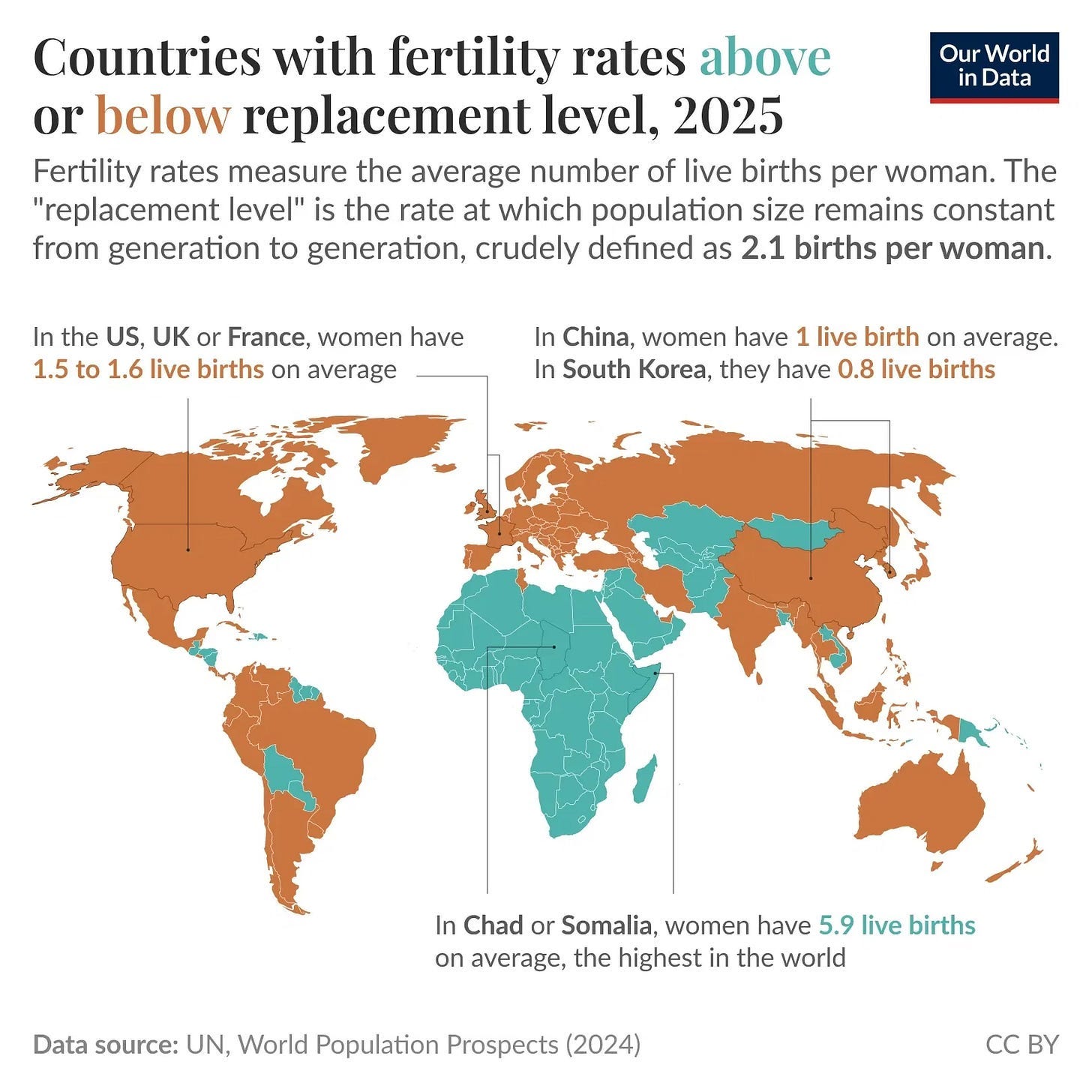
Source: Our World in Data, United Nations
Demography rarely feels urgent until it starts shaping everything else. Fewer births mean older electorates, tighter labour markets, heavier fiscal promises and a sharper fight over who gets to belong.
I’ve got four more charts on political approval, immigration, voter switching and inherited wealth. They show how the social consequences of ageing and inequality are already showing up in the data.
