
The world is learning to live with permanent debt
Five charts to start your day


For $10 a month, or $100 a year, you support a simple mission: spread great data visualisation wherever it comes from. You help fund the work of finding, sourcing and explaining the charts that deserve a wider audience. And you back a publication built on generosity, transparency and the belief that better understanding makes a better world.CHART 1 • The world is learning to live with permanent debt
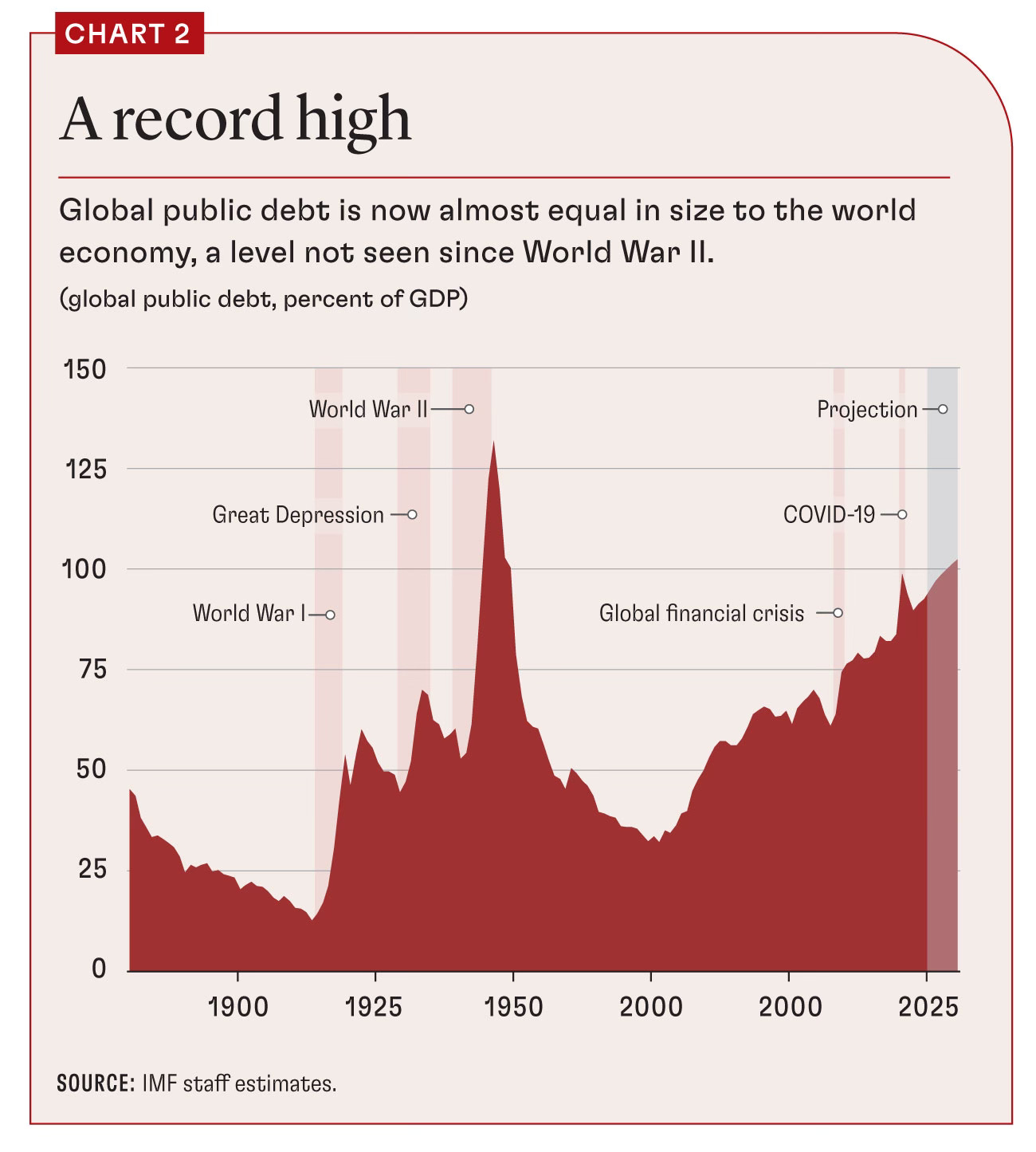
What stands out here is not simply that global public debt is high. It is that high debt no longer looks like a temporary emergency condition. The world has moved from one shock to another, from the financial crisis to the pandemic and now into a weaker growth era with higher geopolitical strain, and each episode has left another layer of borrowing behind. Debt used to surge around wars and then fall back. Now it rises in crises and rarely retreats very far.
That changes the meaning of public borrowing. For much of the twentieth century, very high debt was associated with exceptional events such as world wars. Today it is becoming part of the normal backdrop of economic management. Governments are carrying larger welfare states, older populations, higher interest costs and more demands for industrial, military and energy spending, all at once. In that environment, debt is less a temporary bridge than a permanent feature of the system.
The danger is not just the size of the pile, but the loss of room to manoeuvre. A heavily indebted world can keep functioning for a long time, but it becomes more fragile, less flexible and more exposed to higher borrowing costs. That is what gives this chart its weight. It is not really a picture of one debt crisis. It is a picture of an economic order that has become structurally more reliant on debt to keep moving.
Source: IMF
Permanent debt, concentrated wealth, commodity dependence and nervous capital flows are no longer treated as signs of stress in the system. They are increasingly treated as part of the furniture. That may be the most unsettling shift of all.
Because fragility rarely arrives wearing a name badge. It often looks like stability right up until something breaks. A system can function for years while quietly becoming narrower, harder to manage and less forgiving of mistakes.
I’ve got four more charts that expand on this story, but they’re for paid subscribers. Consider joining if you want the full edition.
