


For $10 a month, or $100 a year, you support a simple mission: spread great data visualisation wherever it comes from. You help fund the work of finding, sourcing and explaining the charts that deserve a wider audience. And you back a publication built on generosity, transparency and the belief that better understanding makes a better world.
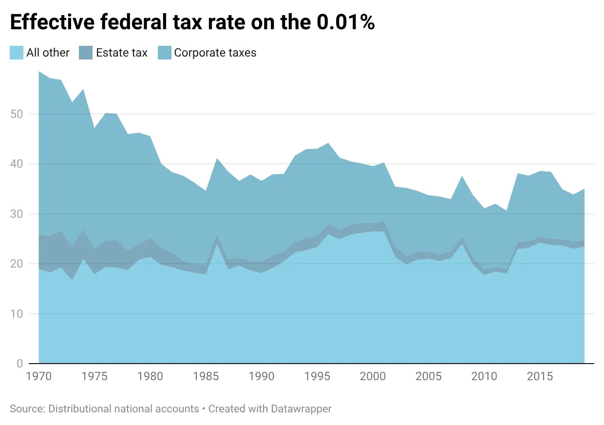
CHART 1 • The richest Americans pay lower effective federal tax rates
Effective tax rate means the share of income actually paid in tax after the system has done its work. For the very rich, that is not captured by the top income-tax bracket alone.
This chart tracks the effective federal tax rate for the top 0.01% of Americans. The line has fallen sharply since the 1970s, with corporate and estate taxes doing less of the work.
There is a real modelling debate about who ultimately bears corporate tax. But the direction still matters. If wealth is concentrating while taxes attached to wealth are weakening, policy is helping decide who keeps the gains.
Source: Paul Krugman
The tax data push the inequality debate away from headline income-tax brackets. For the very rich, corporate taxes, estate taxes and asset ownership shape the effective burden.
Paid subscribers get access to the other four charts: JPMorgan’s second-quarter profit, GE’s break-up, gold’s 2026 pullback and creator earnings. Together, they show how concentration can sit inside banks, corporate structures, asset prices and online attention.
