
The quiet truth hiding in a tariff chart
Five charts to start your days

For twenty years, American politicians have promised to bring manufacturing home. For twenty years, they've vowed to stand up to China. For twenty years, they've sworn to protect American workers. Nothing really happened. Until now.
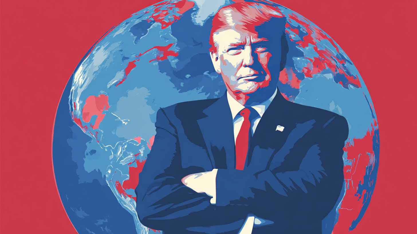
This is Trump’s new vision, whether you like it or not, this his plan to fix things.
It’s blunt. Every country pays a levy to sell into the US market. On top of that sit targeted surcharges, adjusted at the whim of the White House. Allies, rivals, neighbours – no one is exempt. The message is clear: access to the American consumer now comes at a price.
Perhaps he has gone too far. Many economists think so. Tariffs are not paid by Beijing or Brasília. They are paid by the US consumer.
They force supply chains to bend or divert inefficiently. Inflationary pressure creeps in, efficiency ebbs away, and the intended revival of domestic industry remains uncertain. But what does the data say. Let’s take a look at this first chart.
CHART 1 • The quiet truth hiding in a tariff chart
This spread of dot captures, in a single frame, the logic of tariff-first America. On the left you see countries with modest trade flows but punishingly high rates – Brazil, India, Switzerland (where I live). They are small suppliers but big targets, singled out to prove that no one is spared.
In the middle sit America’s closest allies. Germany, France, the UK: still shipping tens of billions in goods, yet facing double-digit tariffs. These are the very partners Washington needs for diplomacy, technology standards and security. They are now being treated as bargaining opponents.
And then the heavyweights. Mexico, China and Canada dominate the top of the chart, with imports well into the hundreds of billions. Despite the walls erected, Americans keep buying. Tariffs have not killed demand; they have simply raised the cost of living. Supply chains reroute, companies relabel goods, but the dependence remains.
That is the striking lesson of the chart: tariffs have become universal, but they are not transformative. They tax consumers without uprooting trade. They irritate allies without truly isolating rivals. They create the appearance of toughness but deliver a mixed reality: higher costs, political friction, and only a slow, uneven re-shoring of traditional industry, which was happen anyway even before Trump entered the White House.
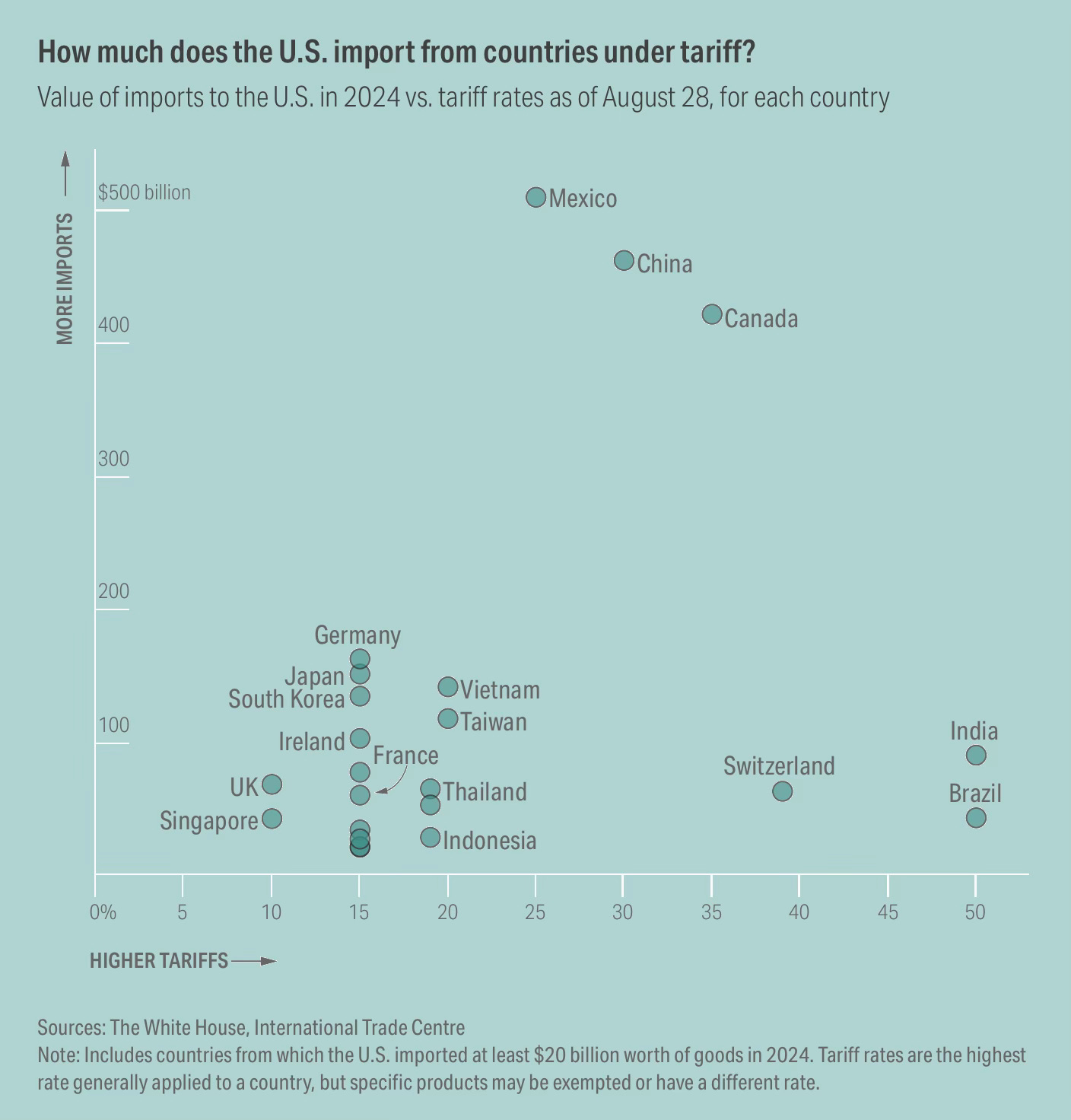
Source: Reuters
This is a fascinating time to live through, even if it’s unsettling. It reminds me of the excitement I felt during the Great Financial Crisis. There was dread, yes, but also the chance to think hard and understand the world better. Back then I learned what debt and securitisation can do to an economy if left unchecked.
Now I’ve got a front-row seat to see whether tariffs work – one of the biggest policy experiments of my lifetime. I expect the results to be poor, but I’m open to being pleasantly surprised. We’re about to find out.
I’ve got four more charts to share today and I hope you’ll take a look. You will need to be a paid subscriber, and if you do sign up you’ll be helping to support my work.
