
The oil price surge is more dangerous than it looks
Five charts to start your day

For $10 a month, or $100 a year, you support a simple mission: spread great data visualisation wherever it comes from. You help fund the work of finding, sourcing and explaining the charts that deserve a wider audience. And you back a publication built on generosity, transparency and the belief that better understanding makes a better world.CHART 1 • The oil price surge is more dangerous than it looks
The real story here is not that oil has gone up. It is that the market for actual crude has become more anxious than the headline benchmark suggests. Brent futures still imply that traders see this as a shock that may pass. Physical North Sea barrels are telling a different story. They are being priced as if supply is scarce now and buyers cannot afford to wait.
That split matters because futures can absorb optimism, positioning and second thoughts. A cargo cannot. When the price of physical crude breaks away from the paper market, it usually means stress is moving through the real plumbing of the oil trade. This is less about sentiment than availability. The market is placing a premium on immediacy, which is often what happens when disruption starts to feel operational rather than theoretical.
That leaves investors and policymakers with a more awkward question than the usual one about whether oil is rising or falling. The issue is whether the benchmark everyone watches is still capturing the most important part of the story. If it is not, the risk is that supply pressure shows up first in fuel costs and inflation rather than in the price most people think they are supposed to watch.
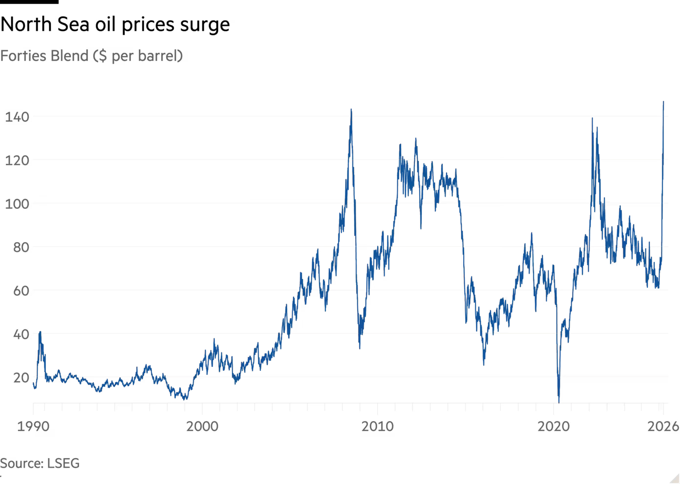
Source: Financial Times
What strikes me most about this set is how often markets can look calm right up until the moment they stop feeling resilient. People like to imagine risk as something obvious and dramatic. More often, it builds quietly in the background, hidden inside workarounds, assumptions and bits of data that seem too technical to matter until suddenly they do.
That is why I keep coming back to charts like these. They do not just show what is happening. They show where the consensus may be looking in the wrong place.
I’ve got four more charts that expand on this story, but they’re for paid subscribers. Consider joining if you want the full edition.
