
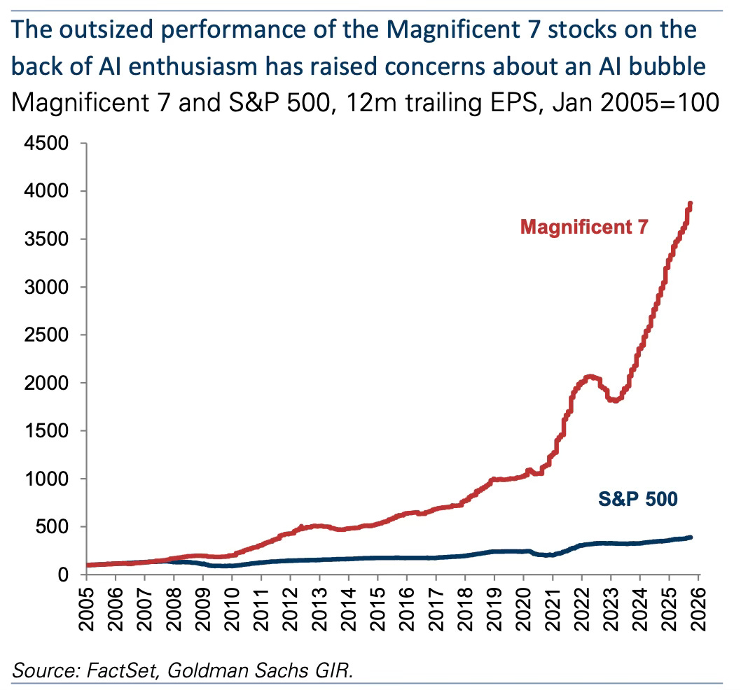
The magnificent seven have left the S&P 500 behind
Five charts to start your day


These five charts capture a moment when the global economy feels both turbocharged and uneven. Markets surge on the strength of a handful of giants. Leadership in technology shifts again. Local supply pressures break long standing price relationships. Investors try to make sense of a world where rates stay high and uncertainty lingers. Even in public health the patterns reveal deep structural divides. The forces shaping this decade are powerful but they are not pulling in the same direction.
Quick note — Killer Charts has been $8/month and $80/year since launch two years ago. From 1 December the price for new subscribers will rise to $10/month and $100/year. If you’ve been meaning to upgrade, you can lock in the old rate for life here.CHART 1 •The magnificent seven have left the S&P 500 behind
The Magnificent 7 have been on a different trajectory for years but this chart shows just how far they have pulled away from the rest of the market. Their earnings have risen more than 4,000 percent since 2005 while the S&P 500 has climbed only modestly. The gap was wide before the AI boom. It has exploded since.
What stands out is the shape of the curve. Until around 2016 the Megacaps grew faster but still broadly in line with the economy. From 2017 onwards their earnings accelerated sharply as cloud computing advertising and mobile ecosystems scaled globally. The real break came after 2022 when AI spending supercharged expectations and valuation multiples. Their earnings momentum now looks almost parabolic which is why investors and policymakers are debating whether this is genuine structural transformation or the early signs of overheating.
The S&P 500 meanwhile tells a slower story. Broad based earnings have grown steadily but nowhere near the pace of the tech giants. That creates a market where leadership is extraordinarily concentrated and where sentiment rests heavily on a handful of companies.
If this divergence keeps widening how stable is a market where so much growth and confidence relies on just seven firms riding the same AI wave?
Source: Goldman Sachs
What stands out across these charts is how concentrated the levers of progress have become. A small cluster of firms drives market confidence. A single technology defines the decade. Local pressures can upend global pricing. Even our health outcomes differ widely depending on systems shaped over generations. These patterns remind us that strength in one part of the system does not guarantee resilience in the rest.
I have got four more charts that expand on this story but they are for paid subscribers. Consider joining if you want the full edition.
