


For $10 a month, or $100 a year, you support a simple mission: spread great data visualisation wherever it comes from. You help fund the work of finding, sourcing and explaining the charts that deserve a wider audience. And you back a publication built on generosity, transparency and the belief that better understanding makes a better world.
CHART 1 • The heat has reached the earnings call
For years, European companies treated extreme weather as something for the sustainability report, rather than the quarterly earnings call. Now heat, drought and wildfire are appearing in the conversations where executives explain sales, costs and profits to investors.
One in 10 European companies worth more than $1bn mentioned those terms this quarter. Look back across the previous decade and I think the long, low baseline is what makes the final bar so striking. Most readings sit below 2%, and even the previous peak in 2018 failed to reach 5%. Rather than completing a steady climb, the latest bar jumps clear of everything before it.
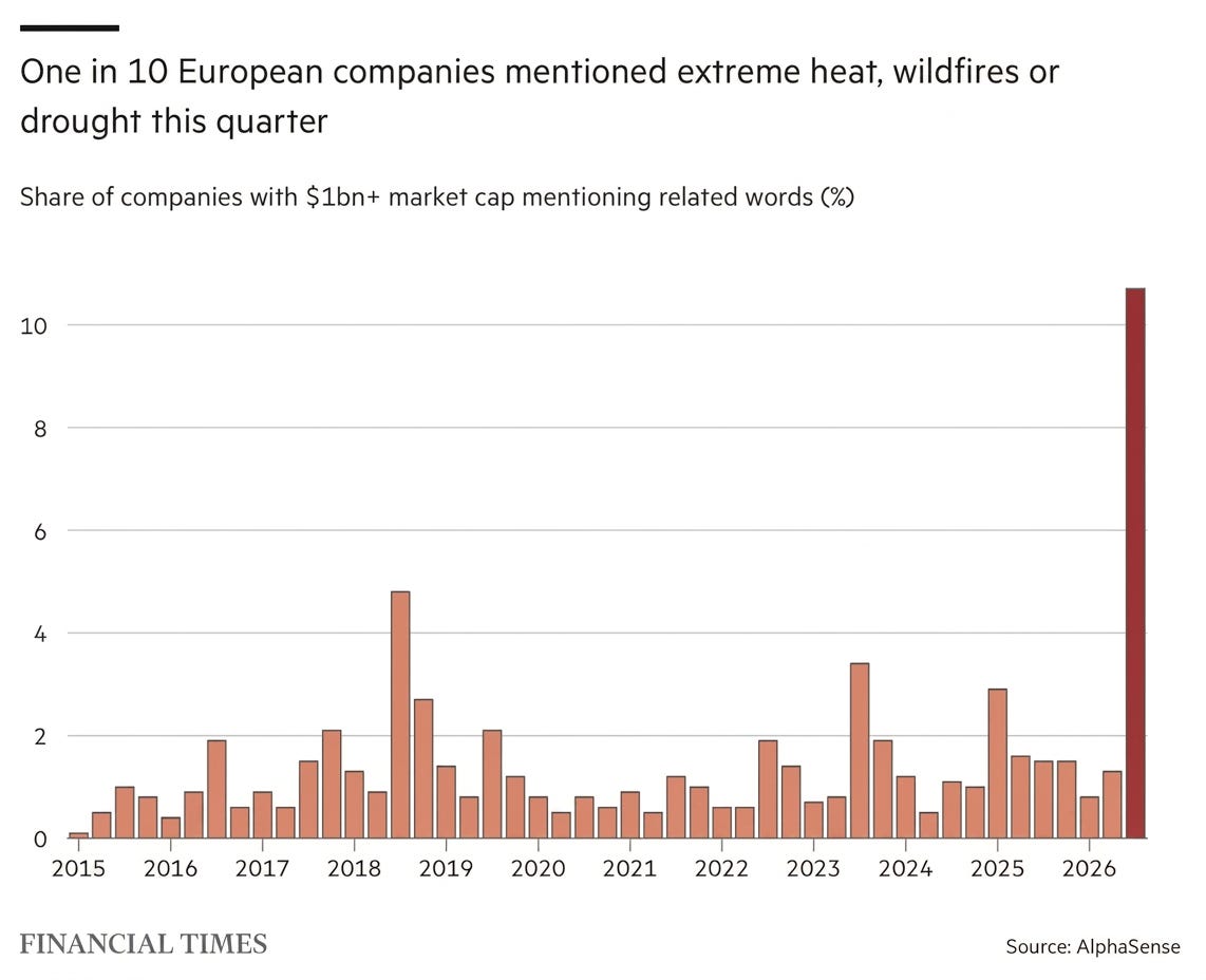
Source: Financial Times
Of course, a mention is not the same as a loss. Some companies sold more fans, air conditioners or sun cream, while others lost working hours, freight capacity or power. Climate change is no longer discussed only as a risk for 2050. It is now appearing in explanations of what happened to European businesses last quarter.
Paid subscribers get access to the other four charts: Europe’s coal retreat, US data-centre opposition, Iranian oil flows and California diesel. Together, they show how energy transitions and supply shocks redistribute costs between companies, communities and consumers.
