
The euro area keeps beating the forecasts
Five charts to start your day


For $10 a month, or $100 a year, you support a simple mission: spread great data visualisation wherever it comes from. You help fund the work of finding, sourcing and explaining the charts that deserve a wider audience. And you back a publication built on generosity, transparency and the belief that better understanding makes a better world.CHART 1 • The euro area keeps beating the forecasts
This chart shows something Europe is not used to. For seven of the past eleven quarters actual growth has come in stronger than economists predicted. The bars tell the story clearly. The orange estimates sit lower than the black outcomes again and again from early 2023 through to 2025.
Part of this reflects a recovery that has proved more resilient than expected. Energy prices normalised faster. Supply chains healed. Households kept spending even as rates rose. And fiscal policy in several countries stayed looser for longer. None of this created a boom but it did prevent the recession many analysts were pencilling in.
Look at the trend and the message is straightforward. Europe is not surging but it is outperforming the narrative.
If the region can keep surprising on the upside will forecasters finally adjust their assumptions or is Europe simply benefiting from a rare run of good luck?
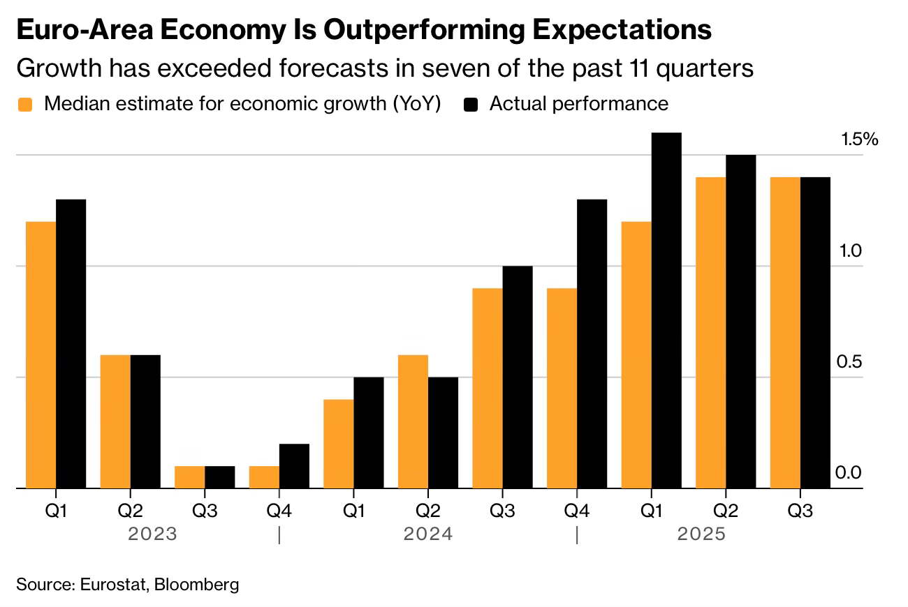
Source: Bloomberg
We often look at the economy through the lens of established narratives. We expect Europe to be sluggish, pension systems to hold firm, and crypto to remain a speculative fringe. But the data today suggests that reality is moving faster than our assumptions.
I’ve got four more charts that expand on this story but they’re for paid subscribers. Consider joining if you want the full edition.
