


For $10 a month, or $100 a year, you support a simple mission: spread great data visualisation wherever it comes from. You help fund the work of finding, sourcing and explaining the charts that deserve a wider audience. And you back a publication built on generosity, transparency and the belief that better understanding makes a better world.
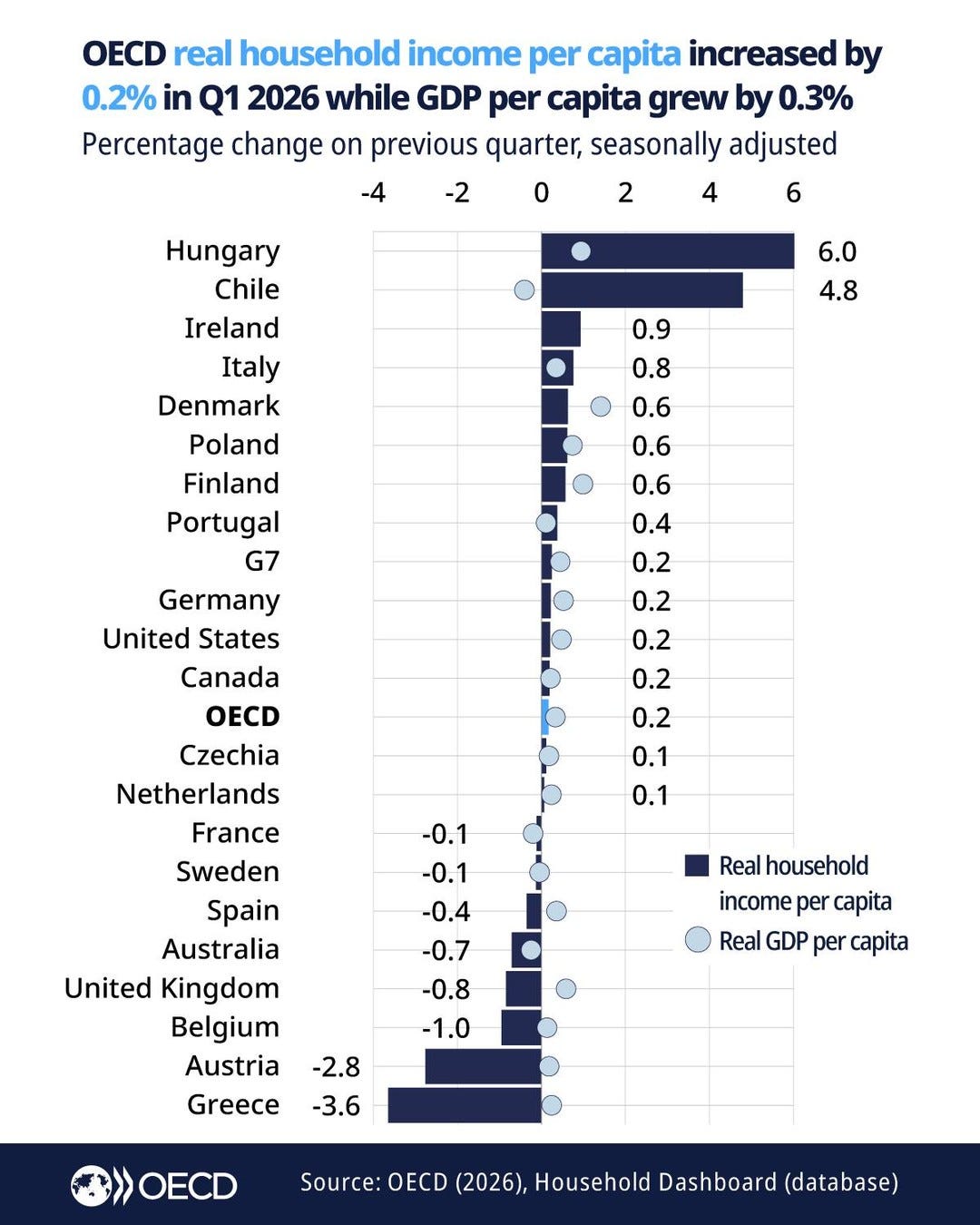
CHART 1 • The economy grew, but incomes didn’t
Americans have been told the economy grew, and that they should now feel richer. It’s the same story across the OECD. But let’s put this into context: GDP per person rose just 0.3% in the first quarter of 2026. Real disposable income per person – the money households actually have once taxes are paid, benefits received and inflation stripped out – rose just 0.2%. No wonder nobody felt a thing.
The average is hiding a lot, however. Hungary’s households gained 6.0% and Chile’s 4.8%, both driven mostly by higher pay. However, the broader trend in this chart is still hard to unsee.
Source: OECD
Britain’s output per person grew while income per person fell 0.8%, which the OECD puts down to taxes, reduced net benefits and inflation. The same split appears for Greece, Austria and Belgium. So this really is a chart of contrast.
So, what’s the take away here? GDP tells you how much a country produced. It says almost nothing about what landed in households’ pockets. For that you need wages, prices, taxes and benefits. That’s why nobody for now feels richer.
Paid subscribers get access to the other four charts: US real pay, battleground affordability, soybean tariff losses and college tuition. Together, they show how labour markets, geography, trade and education determine what growth can buy.
