
The dollar’s dominance is eroding at the margins
Five charts to start your day


For $10 a month, or $100 a year, you support a simple mission: spread great data visualisation wherever it comes from. You help fund the work of finding, sourcing and explaining the charts that deserve a wider audience. And you back a publication built on generosity, transparency and the belief that better understanding makes a better world.
For decades, the global economy has rested on a few quiet assumptions. The dollar would sit at the centre. Trade would keep deepening along familiar routes. Consumption would follow predictable patterns. What the data now shows is not a sudden break, but a steady loosening of those anchors.
CHART 1 • The dollar’s dominance is eroding at the margins
The US dollar remains the backbone of the global financial system. This chart shows that its role is still central, but no longer as exclusive as it once was.
For the first time in decades, the dollar’s share of global foreign exchange reserves has fallen below 50%. What is notable is not the rise of another currency, but the steady accumulation of gold. Central banks have been increasing gold holdings while gradually reducing their exposure to dollar assets.
This shift reflects structural concerns rather than short-term market moves. Geopolitical tensions, the expanded use of financial sanctions and growing unease about long term US fiscal sustainability have all encouraged reserve diversification. Gold offers neutrality and independence from any single issuer, even though it provides no yield.
Importantly, this is not a collapse in confidence. The dollar still dominates trade invoicing, global funding markets and cross border finance. What is changing is its monopoly position at the margin. Reserve allocations tend to move slowly, until they do not.
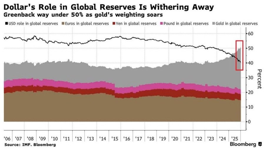
Source: Bloomberg
When global change happens slowly, it is tempting to dismiss it as noise. Yet history shows that marginal shifts often do the real work. By the time they feel obvious, the adjustment is already well advanced.
I have four more charts that push this theme further and explore what these shifts mean for capital, policy and long term positioning. They are for paid subscribers. If you want the full edition and the deeper context behind it, consider joining.
