
The countries with the most farmland are not who feed the world
Five charts to start your day

For $10 a month, or $100 a year, you support a simple mission: spread great data visualisation wherever it comes from. You help fund the work of finding, sourcing and explaining the charts that deserve a wider audience. And you back a publication built on generosity, transparency and the belief that better understanding makes a better world.CHART 1 • The countries with the most farmland are not who feed the world
It is tempting to read this as a map of agricultural power. China, the US, Australia. Big countries with vast land. But the definition hides more than it reveals. Agricultural land includes pasture, which means much of what appears productive is simply land used for grazing. Australia’s 1.4 million square miles looks dominant until you realise much of it produces very little food per acre.
China tells a more interesting story. It has less arable land per person than most major economies, yet it feeds 1.4 billion people. That has forced a different model, one built on intensity rather than abundance. Irrigation, fertiliser use, and crop yields matter more than sheer land size. The US sits somewhere in between, combining scale with industrial efficiency and export strength.
The real gap emerges in places that appear rich in land but poor in output. Kazakhstan and Russia have vast agricultural footprints, yet climate and infrastructure limit what that land can actually produce. Africa faces a similar problem, but for different reasons. The constraint is not geography, it is investment and systems.
The chart looks like a ranking of land. It is really a map of constraints.
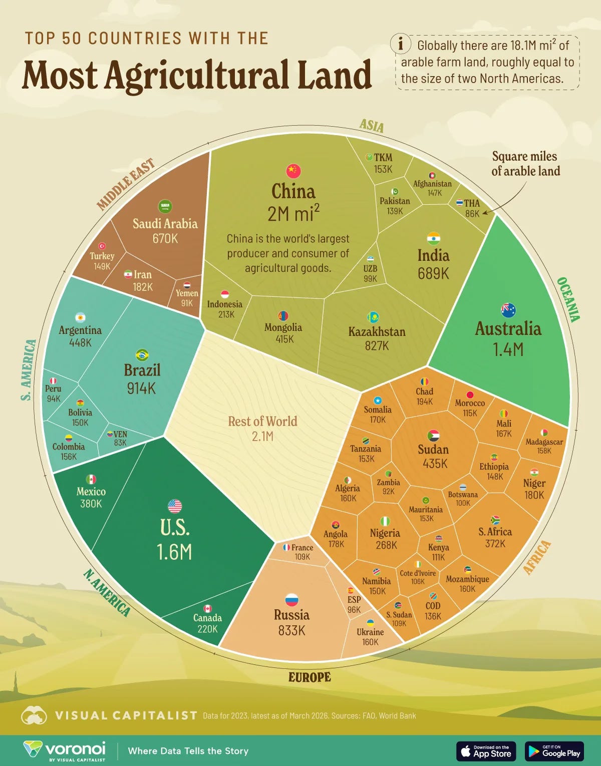
Source: Visual Capitalist
There is a quiet misconception that scale solves problems. More land, more infrastructure, more capital. The data suggests otherwise. Without the systems to use it effectively, scale becomes misleading, even comforting in the wrong way.
That matters because it changes how we think about resilience. It is not built on how much we have, but on how well we can adapt and convert it into something useful when conditions shift.
I have four more charts that explore this gap between appearance and reality and where it matters most next, but they are for paid subscribers. Consider joining if you want the full edition.
