The cost of stepping back from climate action
Five charts to start your day
Quick note — Killer Charts has been $8/month and $80/year since launch two years ago. From 1 December the price for new subscribers will rise to $10/month and $100/year. If you’ve been meaning to upgrade, you can lock in the old rate for life here.CHART 1 • The cost of stepping back from climate action
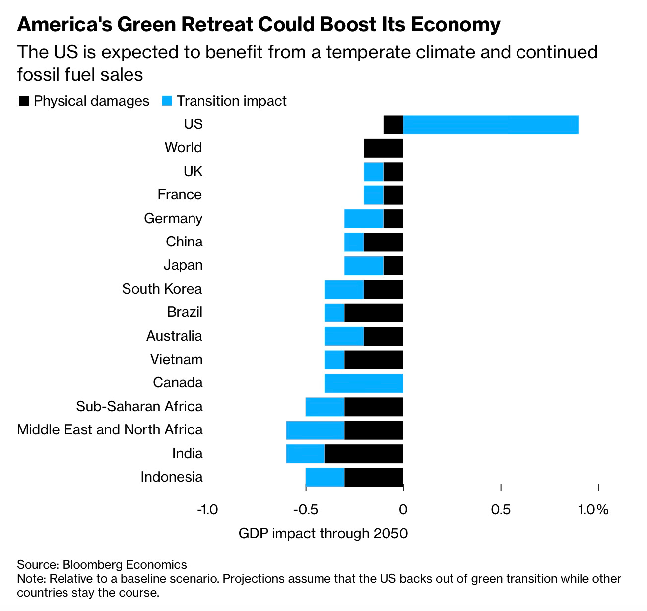
This chart shows what happens when a superpower steps off the climate train , but everyone else stays on it. Here, the US slows its green energy transition while other countries keep going.
By 2050 America gets a small lift in GDP from avoiding some of the upfront costs of clean technology and from selling more fossil fuels. That is the long blue bar in the chart, the transition impact. The black bar, which shows extra physical damage from climate change at home, stays relatively modest. On the face of it the trade looks clever for US economic growth.
The mood darkens once you scan down the axis to the rest of the global economy. For most countries the blue bars are negative and the black bars bite harder. Emerging markets are hit hardest. Many European economies end up poorer. Even China and Japan see a drag on growth. The story is simple. When a major economy eases off its climate commitments the cost does not vanish. It moves. Heat, floods and storms hit elsewhere. Trade partners adjust. Supply chains become more fragile. Financial markets start to price in higher climate risk. The world absorbs the shock.
So here is the question. Should short term gains at home ever outweigh the long term climate bill that lands on everyone else?
Source: Bloomberg
Progress is rarely smooth. It comes with detours, delays and costs that fall unevenly across countries, households and industries. The data reminds us that optimism is not a plan and that structural forces often pull harder than sentiment.
I worry sometimes that we focus too much on the moment in front of us and not enough on the forces building beneath it. Yet the long view still matters. That is where the real story often sits.
I have four more charts that expand on this theme, but they are for paid subscribers. Consider joining if you would like the full edition.


