The bond vigilantes are back
Five charts to start your day
When do markets stop believing in fairy tales? Perhaps they already have. After forty years of slumber, they have been finally awoken.
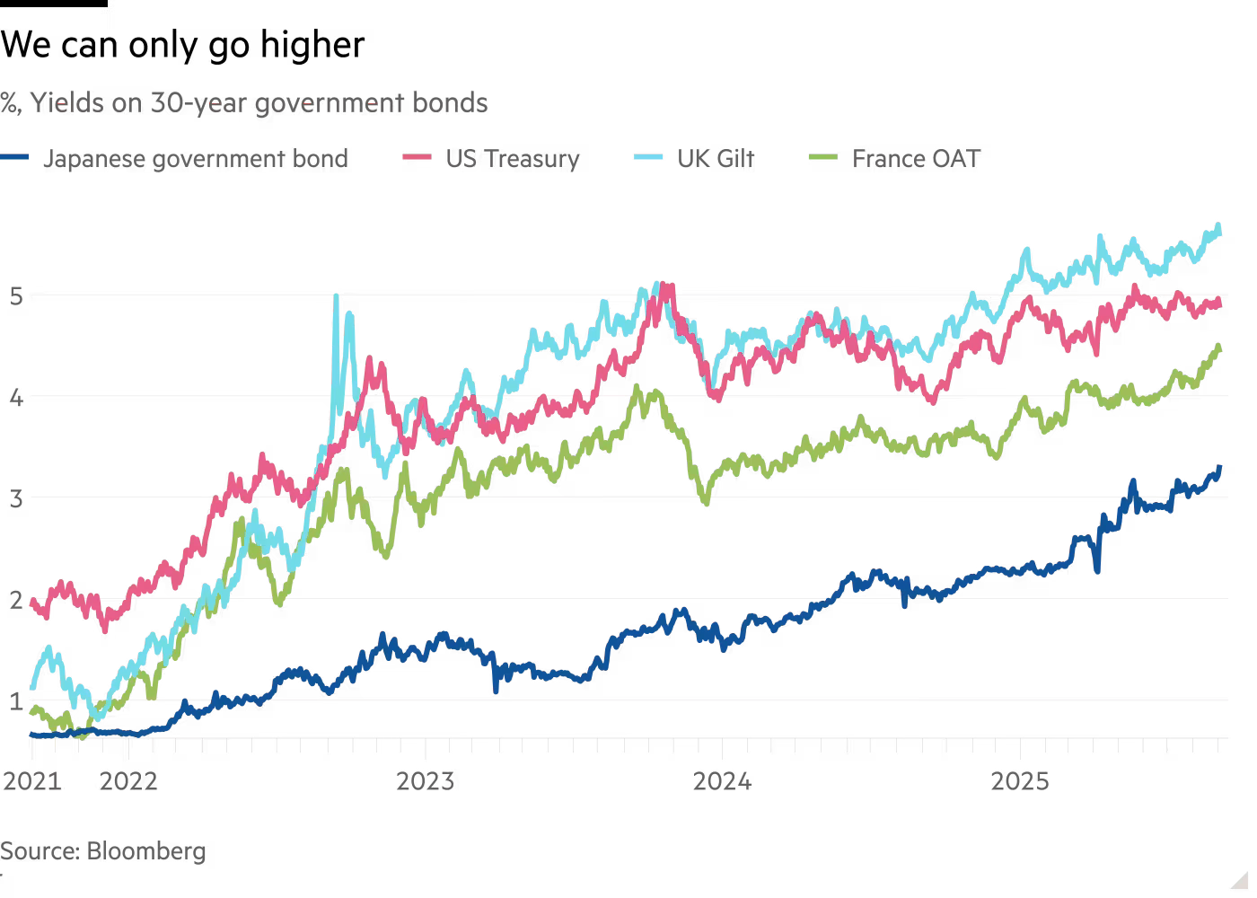
Something profound is unfolding in government bond markets that deserves far more attention than it currently receives. Long-term yields have risen sharply across the developed world. Japan's 30-year bonds now yield above 3.2%, their highest level on record. British 30-year gilts have touched 5.6%, territory not seen since 1998. US Treasuries of similar maturity recently approached 5%, although they have recently fallen moderately. Even France, that supposed pillar of European stability, watches its long bonds yield 4.3%.
Japan is the canary in this particular coal mine. With debt at 260% of GDP and half their bonds owned by their own central bank, they face a dilemma: allow yields to rise and risk fiscal crisis, or suppress them and watch the yen dissolve.
Britain's predicament proves equally unforgiving. Each basis point higher in gilt yields tightens the fiscal vice. The market has rendered its verdict: the sums don't add up.
Even the US, protected by reserve currency status, isn't immune. When presidents pressure the Fed to cut rates to reduce government interest bills, we've entered dangerous territory. The age of consequence-free borrowing has ended. Not with fanfare, but with the quiet insistence of compound interest.
CHART 1 • The bond vigilantes are back
Let's be honest. The most striking thing about this chart is how boring it is. Four major economies, wildly different monetary policies, different debt levels, different politics, and their yields just march up together.
The Fed hiked aggressively. The BOJ barely moved. The ECB was somewhere in between. The UK had a full-blown gilt crisis (after iceberg lettuce Truss). But it didn’t matter, did it? All the lines went up.
That is what is so insightful. Nothing any individual central bank did mattered. They all lost control at the same time. When every developed market yield rises regardless of local policy, you're seeing something bigger than country-specific stories. Either global inflation expectations have permanently reset higher, or there's been a fundamental repricing of what sovereign debt is worth.
I used to buy the old “US dollar is king” story. Well, I still do, I just also believe that kings are mortal. Even our beloved King Charles will have to hand over the throne one day. And yes, the US has the largest, most liquid bond market in the world – the US Treasury market. And it's also true that there are few alternatives to the dollar as a reserve asset, apart from gold. But that doesn't mean the long end of the bond market needs to give a “silly sausage” about what the Fed wants.
In fact, I would go as far as to say this isn't even about fiscal dominance, or whether you believe in it or not. The whole asset class has been revalued and the mechanism behind how that revaluation is taking place has changed. Like tech stocks did in 2000 or housing in 2007, we are seeing a global repricing in the bond market that we have little control over.
That's what makes this chart unsettling. It suggests individual central bank decisions are just theatre. The real force driving long bond yields is something they can't control. They probably never could anyway.
Source: Financial Times
Sorry that was a bit pessimistic. But it is hard to stomach the status quo when clearly the economic regime has shifted. We need to adapt and be vigilant of the change around us.
I have four more charts to share with you. But you will have to become a paid subscriber if you are interested.


