


For $10 a month, or $100 a year, you support a simple mission: spread great data visualisation wherever it comes from. You help fund the work of finding, sourcing and explaining the charts that deserve a wider audience. And you back a publication built on generosity, transparency and the belief that better understanding makes a better world.
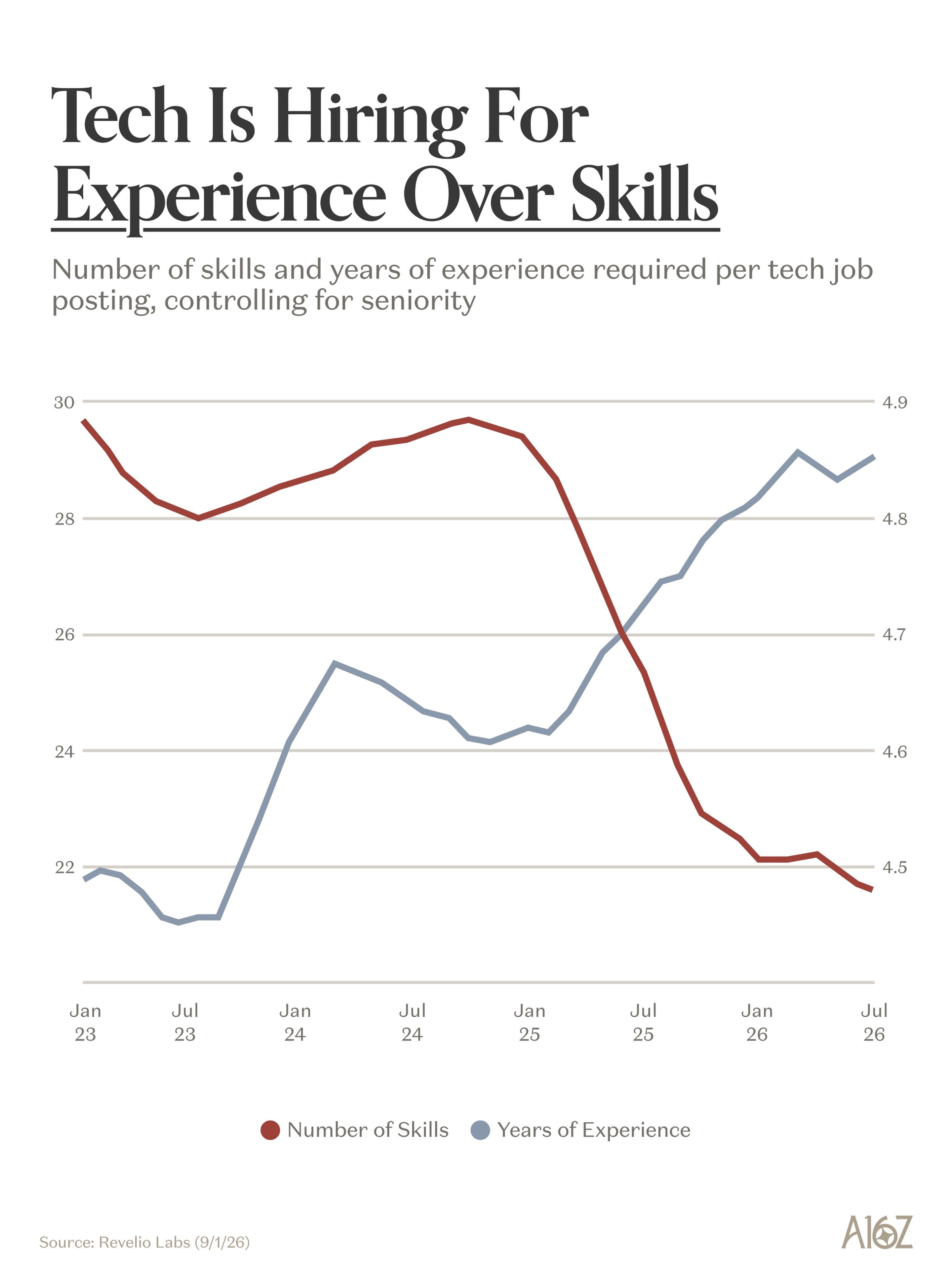
CHART 1 • Tech is hiring for experience over skill
This is a slightly confusing chart because the axes are not labelled properly and, as you can see, the secondary axis is slightly distorted because it is based on a small range. I can see the logic here, and the story is quite clear.
The red line shows skills falling from roughly 30 to 22. The blue line represents the years of experience requested, which has risen from about 4.5 years to 4.85 years. So employers are writing a shorter list of skills but asking for more experience overall, with a focus on the skills that matter most to them.
Source: a16z
But, as I said, be careful how you read this chart because the axes are distorted. The fall in listed skills is indeed substantial, but the increase in experience required is quite moderate, representing an increase of a few months.
Overall, I would say: be careful when interpreting charts like this because it does not necessarily show that AI is driving this trend, although you can probably infer that it is to a limited extent. That is why I still like this chart.
Paid subscribers get access to the other four charts: AI-assisted homework, the shrinking graduate premium, London school closures and scientific disruption. Together, they show how technology and demographics are changing what education and experience are worth.
