


For $10 a month, or $100 a year, you support a simple mission: spread great data visualisation wherever it comes from. You help fund the work of finding, sourcing and explaining the charts that deserve a wider audience. And you back a publication built on generosity, transparency and the belief that better understanding makes a better world.
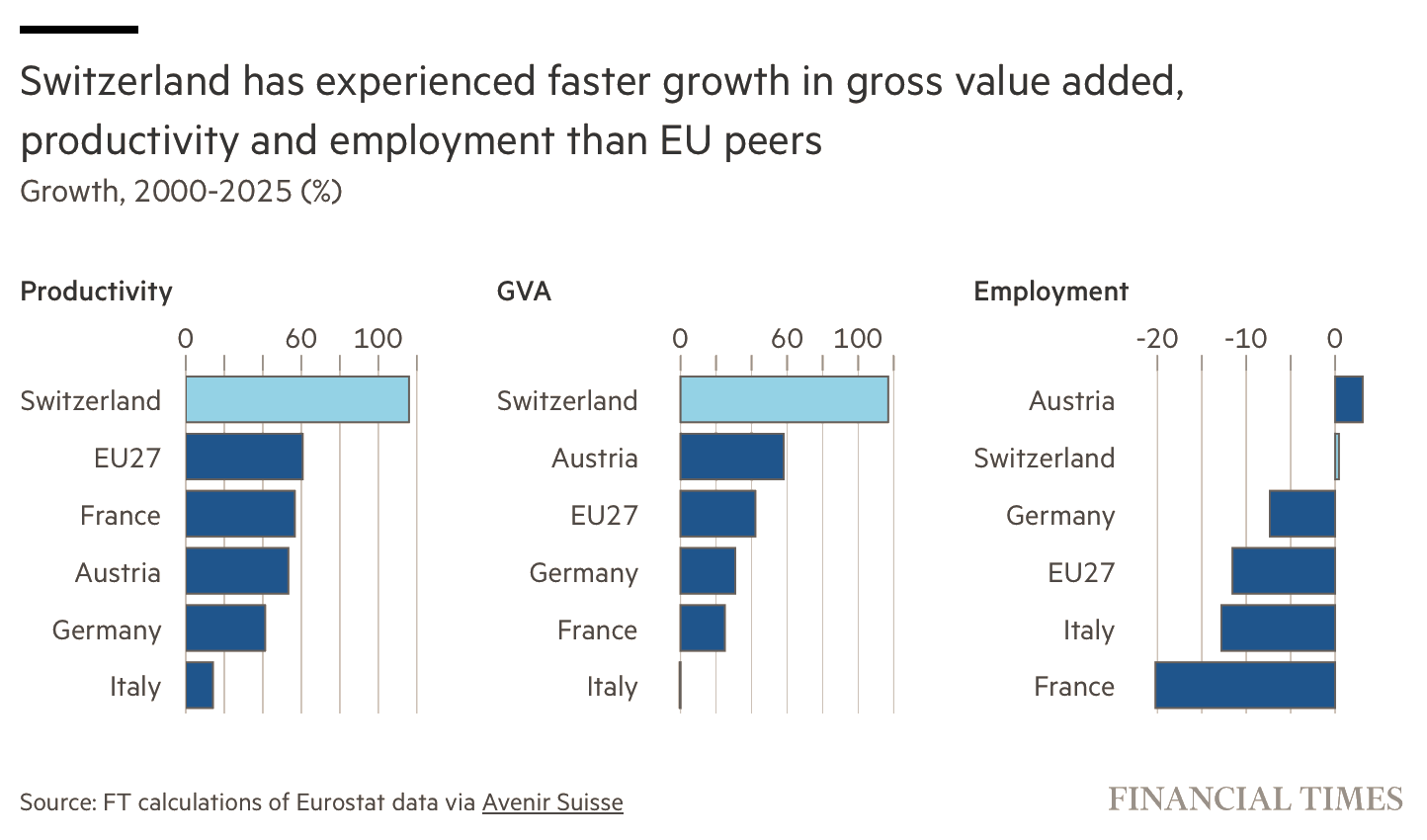
CHART 1 • Switzerland grew beyond job creation
For Swiss voters, arguments over migration, housing and infrastructure turn on a basic question: did growth make existing residents better off, or mostly make the economy bigger? The strongest evidence against a simple population story is that Swiss productivity growth since 2000 is roughly twice the EU27 rate, even though Austria edges Switzerland on employment.
Switzerland also leads all five comparators on gross value added, while France and Italy occupy the weak end of the three rankings. Persistent net migration supplied expanding businesses with workers and scarce skills. Investment, technology and high-value industries also increased output per worker. Those forces can reinforce each other: a larger skilled workforce expands production, while greater productivity makes each job more valuable.
Source: Financial Times
I would treat the employment panel as the restraint that makes the comparison persuasive. It shows that Switzerland’s extraordinary aggregate performance was not simply the product of uniquely rapid job creation. But the bars do not reveal prices, currency effects or gains per resident, and real median wages rose by a much smaller 17%. Switzerland’s success is substantial; judging its benefit to residents requires looking beyond the longest bar.
Paid subscribers get access to the other four charts: Asia and Africa’s megacities, burger purchasing power, global broad money and the bond market’s response to Kevin Warsh. Together, they show how workers, cities, currencies and institutions turn growth into lived economic power.
