
Swiss banks disappear as consolidation deepens
Five charts to start your day


Quick note — Killer Charts has been $8/month and $80/year since launch two years ago. From 1 December the price for new subscribers will rise to $10/month and $100/year. If you’ve been meaning to upgrade, you can lock in the old rate for life here.CHART 1 • Swiss banks disappear as consolidation deepens
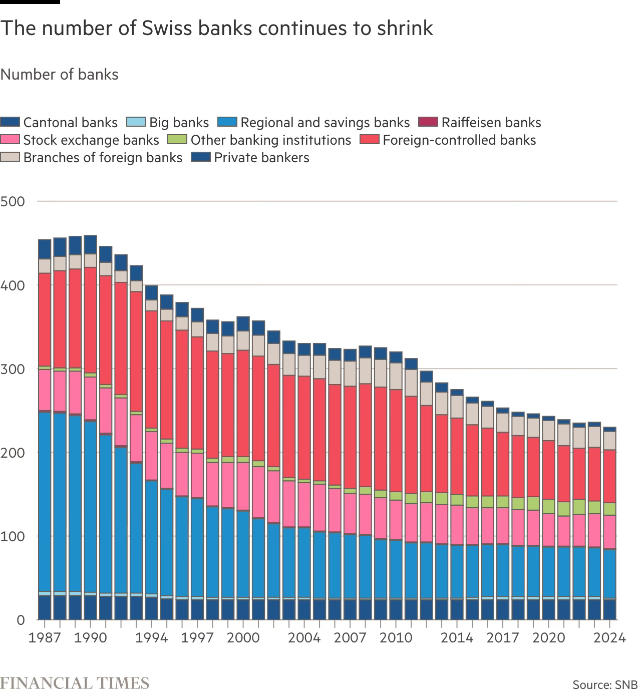
Switzerland once had more than 450 banks. Today fewer than 230 remain. From Zurich this transition is hard to miss. When Credit Suisse was swallowed by UBS, it removed not just a logo from Paradeplatz but a pillar of the market and a valuable client for me personally. The centre of gravity has shifted.
In the late 1980s regional and savings banks, foreign controlled lenders and private bankers filled every corner of the financial map. As regulation tightened and compliance costs rose, many smaller institutions merged or disappeared. The global financial crisis accelerated the process and digital banking has reinforced it. The survivors are larger, more diversified and more tightly supervised, but the local variety that once defined Swiss finance has faded.
Yet this is not a simple story of decline. The Swiss banking system is still vast and, if anything, more innovative. Pressure from fintech, crypto and now AI has forced the sector to adapt, upgrade and automate. There are fewer names on the doors, but more technology behind the scenes.
Is this concentration a sign of strength and modernisation, or does it create new single points of failure in a system the world still relies on? The verdict is still out on that I’m afraid. There are too many factors to diagnose an explanation in the chart below.
Source: Financial Times
Now let’s look at the bigger picture. The thread running through all of this is the concentration of power, capital and attention. Whether in Swiss banking or American equities, the centre keeps getting heavier. The danger is that what looks like resilience may in fact be brittleness disguised by momentum. I didn’t really mention that above, but I should have.
Markets often mistake scale for safety. But when everything leans on the same few pillars, small cracks can carry further than they should. The question is not just who leads, but what happens if the leader stumbles. I worked through the Financial Crisis 17 years ago, so I feel this. I’m not sure this chart shows fragility in the Swiss banking sector, so I disagree with the FT story that accompanied this chart. However, I also do think it does not demonstrate strength, which I think visually this chart displays brilliantly.
I have four more charts that expand on this theme, but they’re for paid subscribers. Consider joining if you want the full edition.
