
Small markets can dominate annual returns
Five charts to start your day


For $10 a month, or $100 a year, you support a simple mission: spread great data visualisation wherever it comes from. You help fund the work of finding, sourcing and explaining the charts that deserve a wider audience. And you back a publication built on generosity, transparency and the belief that better understanding makes a better world.CHART 1 • Small markets can dominate annual returns
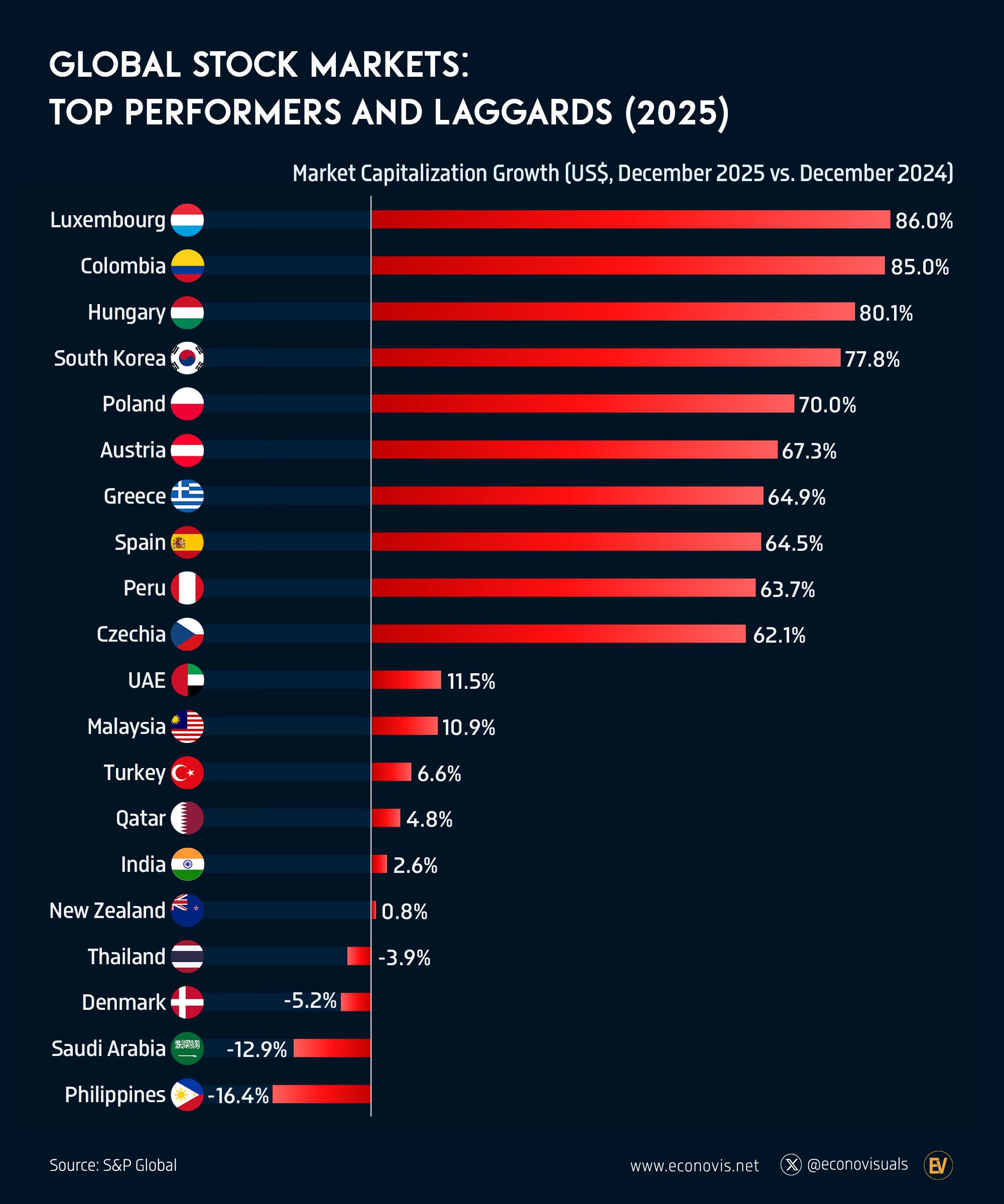
Most investors assume that the biggest markets drive the biggest gains. In practice, annual performance often comes from much smaller places.
Looking at stock market capitalisation growth over the past year, several smaller or less followed markets sit at the top. Meanwhile some large, liquid markets barely moved or went backwards.
This pattern usually reflects starting points rather than structural superiority. Smaller markets tend to be more cyclical, more concentrated and more sensitive to capital inflows. When conditions turn, the rebound looks spectacular.
The mistake is extrapolation. Strong one year performance in a small market often says more about prior weakness than future dominance.
How do you separate a cyclical rebound from a durable shift in market quality?
Source: Econovisuals
We chase what has just worked, distrust what feels dull, and underestimate how much time and behaviour shape outcomes.
I have four more charts to share with you, but they are for paid subscribers. If you want the full edition and the deeper thread behind it, consider joining.
