


For $10 a month, or $100 a year, you support a simple mission: spread great data visualisation wherever it comes from. You help fund the work of finding, sourcing and explaining the charts that deserve a wider audience. And you back a publication built on generosity, transparency and the belief that better understanding makes a better world.
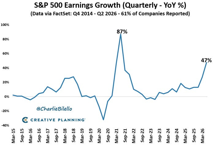
CHART 1 • S&P 500 earnings growth boosted by paper gains
There has been a surge in S&P 500 earnings growth in 2026, with year-on-year growth approaching 50%. That is highly unusual outside a recovery from a major crisis.
Part of the increase reflects genuinely strong corporate profits. But the headline figure has also been inflated by enormous accounting gains by a small number of very large technology companies. Alphabet, for example, reported US$98 billion of net other income, largely because the estimated value of its equity investments had risen.
This was not US$98 billion earned from Google Search, YouTube or its cloud business. This was also not US$98 billion received in cash. It was mainly a paper gain recorded because Alphabet’s investments had become more valuable.
Because Alphabet is one of the largest companies in the S&P 500, that gain helped push earnings growth for the entire index to a much higher level. US corporate earnings are still growing strongly, but the headline figure exaggerates the improvement in companies’ underlying businesses.
Source: Charlie Bilello
For investors, the lesson is simple. The S&P 500 earnings figure looks extraordinarily powerful, but part of that strength comes from gains that may not be repeated and could even reverse. Charts showing earnings growth close to 50% like this therefore need to be interpreted with care, especially if that figure hasn’t been caused from a rebound after a crisis.
Paid subscribers get access to the other four charts: foreign ownership of US assets, the rise of technology fortunes, Europe’s billionaire map and the long history of global GDP. Together, they show how ownership and market prices are concentrating economic power.
