


For $10 a month, or $100 a year, you support a simple mission: spread great data visualisation wherever it comes from. You help fund the work of finding, sourcing and explaining the charts that deserve a wider audience. And you back a publication built on generosity, transparency and the belief that better understanding makes a better world.
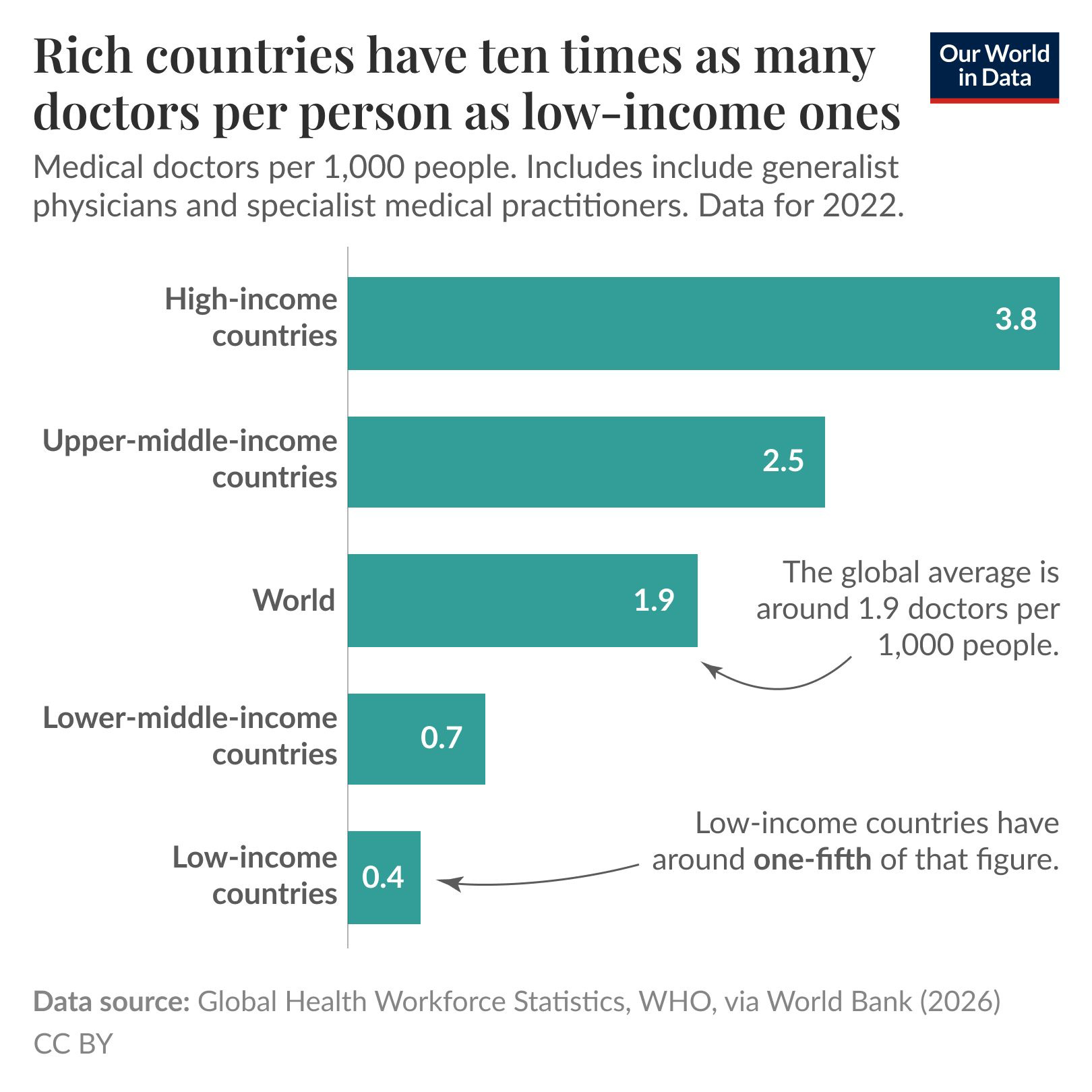
CHART 1 • Rich countries have ten times as many doctors per person
A good healthcare system is often determined by the ability to fund it and ensure that you have enough doctors and nurses to treat patients. Quite often, healthcare systems are under strain because they lack the resources needed to take care of the population that cater for. This is what this chart is all about and the data behind it is quite interesting.
In 2022, high-income countries had an average of 3.8 doctors for every 1,000 people. In low-income countries, the figure was just 0.4, while the global average is around 1.9. Although this chart is four years old, it’s still very relevant today and this trend hasn’t dramatically changed since.
Of course, the number of doctors is only one part of the picture. Access to nurses, medicines, affordable treatment and good-quality hospitals also matters, particularly in rural areas. Even so, the gap is enormous. Wealthier countries have far more medical staff available, while poorer countries are trying to expand healthcare systems that are already losing workers to migration (to richer countries).
Source: Our World in Data
I would read the rest of this newsletter in the same frame of mind. What limits us in everyday life is often something we barely notice until it stops working. That could be the number of doctors, the availability of buses or the reliability of running water.
The danger is that we forget how fortunate we are to have the infrastructure we do today compared with our forefathers. We enjoy an incredibly high quality of life, and it is easy to overlook that when something does not work the way we expect it to.
Paid subscribers get access to the other four charts: 2026 liveability scores, heatwave-driven cooling demand, Latin American venture capital and India’s largest trade deficits. Together, they show how daily life depends on staff, infrastructure, energy demand, capital allocation and trade exposure.
