


For $10 a month, or $100 a year, you support a simple mission: spread great data visualisation wherever it comes from. You help fund the work of finding, sourcing and explaining the charts that deserve a wider audience. And you back a publication built on generosity, transparency and the belief that better understanding makes a better world.
CHART 1 • Paid parental leave differs widely by country
I remember when my daughter was born that I did not bother to take paid parental leave because it was too bureaucratic and cumbersome to organise in the UK. Instead, I just took off some annual leave as I knew I probably would not be going on holiday anytime soon, especially after the birth of a newborn.
This was of course fourteen years ago and my daughter is now a teenager. Unfortunately, as you can see from this chart, not a lot has changed in the UK for fathers.
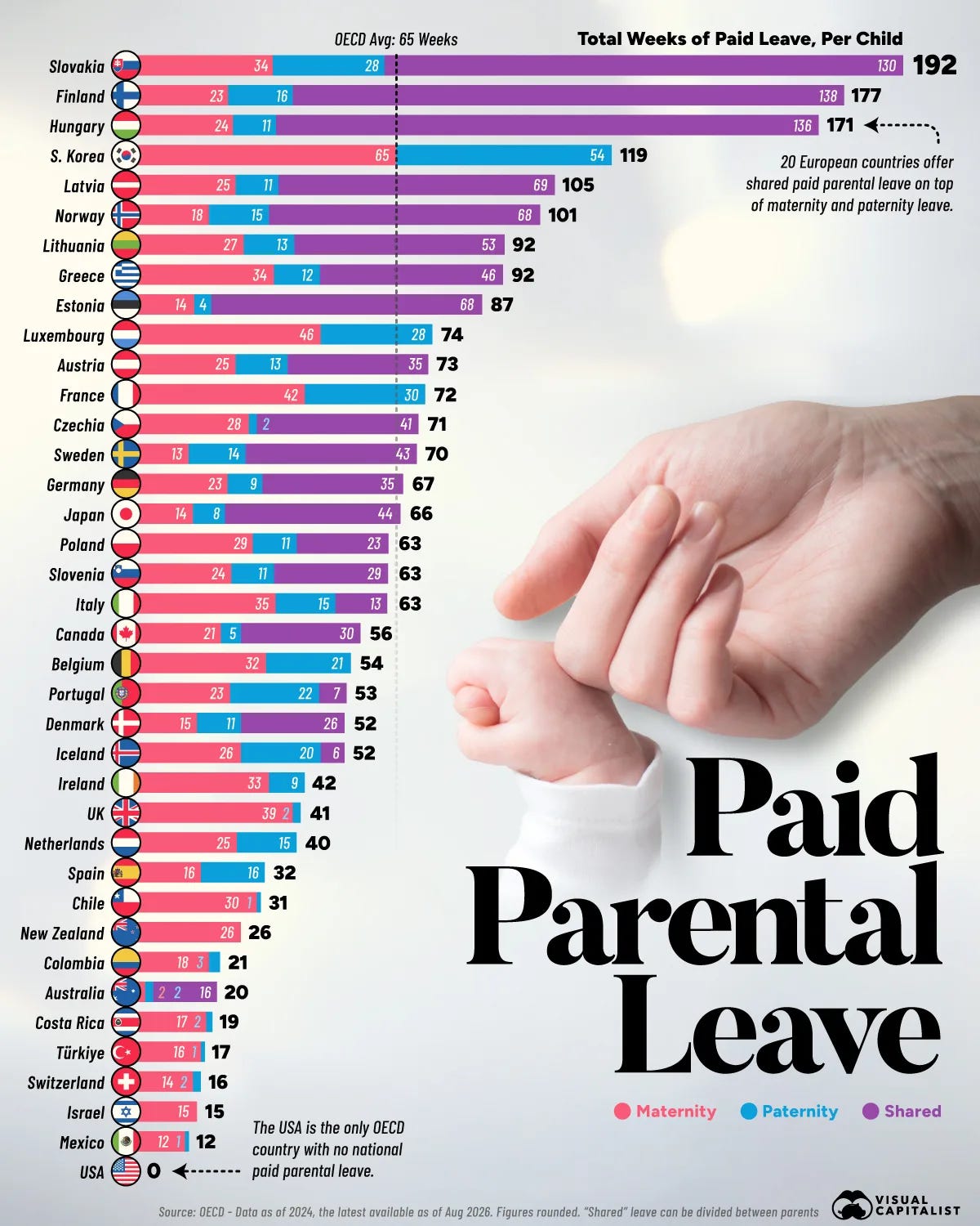
Source: Visual Capitalist
What you can see from this list is that the most generous allowance appears to come from European countries. In fact, twenty European countries offer shared paid parental leave on top of maternal and paternity leave, which is incredible.
Unfortunately, the same cannot be said for the UK or even Switzerland, where I now live. I hope that in the future things will change and parents will have more flexibility to spend time with their children despite the need to work.
Paid subscribers get access to the other four charts: Swiss home ownership, US generational wealth, market-funded retirement and international students. Together, they show how institutions and accumulated assets widen or narrow the choices available at each stage of life.
