


For $10 a month, or $100 a year, you support a simple mission: spread great data visualisation wherever it comes from. You help fund the work of finding, sourcing and explaining the charts that deserve a wider audience. And you back a publication built on generosity, transparency and the belief that better understanding makes a better world.
CHART 1 • Orbital launches are crowding the skies
Space used to be easy to picture as a series of rare national moments. The launch calendar now looks more like an industrial schedule.
Global orbital launches rose sharply through the early 2020s and reached a record in 2025. The 2026 bar is only year to date, but it is already high enough to show that the boom has not faded.
More launches mean more satellites, more data, more debris risk and more private infrastructure in orbit. Space is becoming a working commercial system, not just a place for national missions. The launch count is one way to see that economy being built.
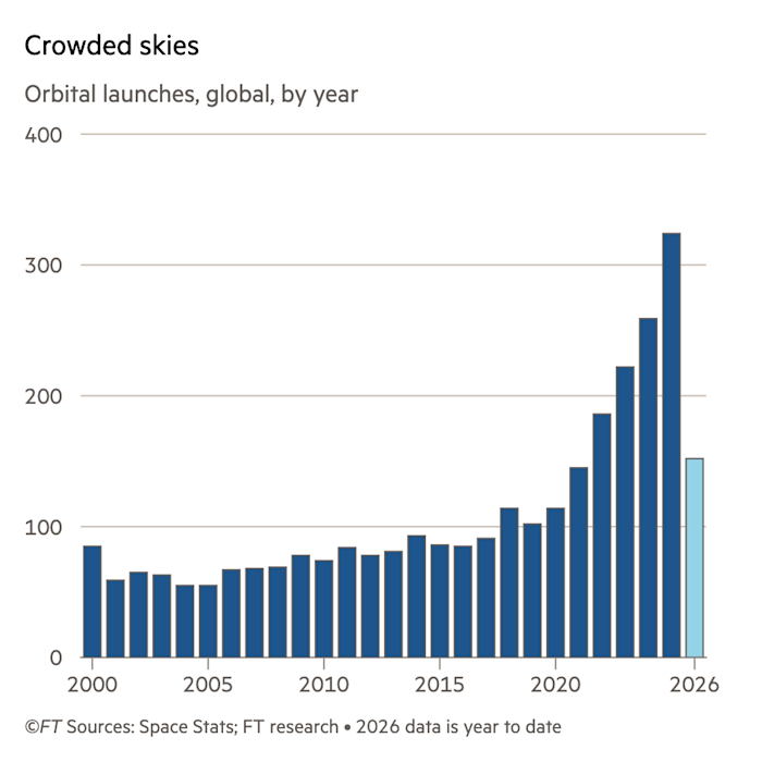
Source: Financial Times
This chart makes the space economy tangible. More launches mean more infrastructure, more business, more congestion and more privately owned hardware in orbit.
Paid subscribers get access to the other four charts: global AI adoption, whale catches since 1985, the media bias map and world population by latitude and longitude. Together, they show how scale can make a familiar story harder to ignore.
