
New UK tax changes hit richest households hardest
Five charts to start your day


For $10 a month, or $100 a year, you support a simple mission: spread great data visualisation wherever it comes from. You help fund the work of finding, sourcing and explaining the charts that deserve a wider audience. And you back a publication built on generosity, transparency and the belief that better understanding makes a better world.CHART 1 • New UK tax changes hit richest households hardest
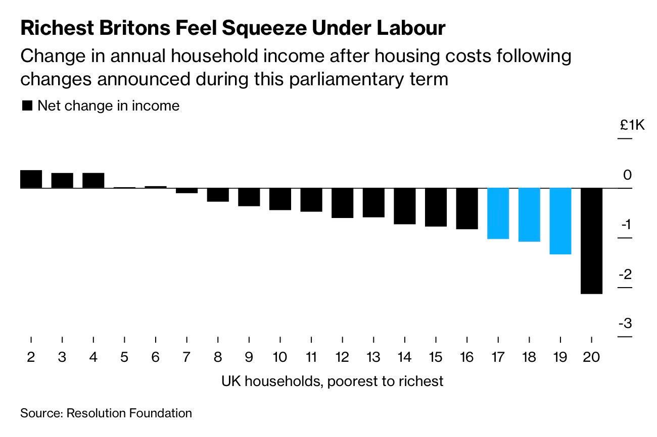
So let us begin with taxes. The new parliamentary term is already reshaping the distribution of income in the UK. While most households see only small changes, higher earners are facing some of the sharpest falls in living standards in years as the latest UK tax changes start to bite.
This chart tracks how annual disposable incomes change after housing costs across the income spectrum. The poorest households see only marginal shifts. Middle income groups also experience modest declines in real income. The picture changes at the top of the income distribution. Households in the richest deciles face cuts that deepen with every step up the ladder, and the top 10% see an annual hit of more than £2,000.
This pattern reflects a mix of new UK tax policies, frozen thresholds and changes to allowances that lean more heavily on high earners. The Resolution Foundation think tank notes that these measures are designed to rebalance the tax burden after a long period in which fiscal tightening fell more evenly across the income scale.
The numbers hint at a broader political shift. Income redistribution is back at the centre of UK economic policy and the government wants the richest households to shoulder more of the adjustment in the early years of this term.
Source: Bloomberg
What strikes me is how uneven the gains and losses have become. Some groups face sharper tax bills. Others face slower wage progress. There is a human tension running through all of this. We want systems that reward effort yet we live in a world where outcomes depend heavily on timing, geography and inherited advantage. The charts do not solve that tension but they make it visible.
I have four more charts that extend this story and look at how these shifts may shape the next decade. They are for paid subscribers. Consider joining if you want the full edition and want to support the work that makes this newsletter possible.
