
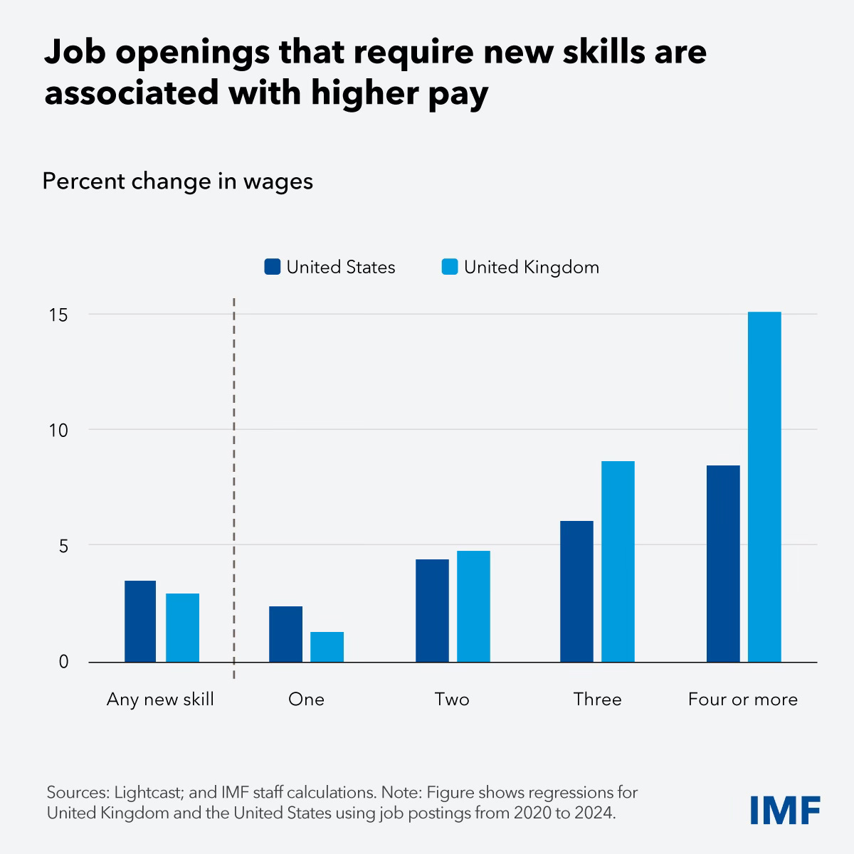
New skills brings a large pay boost in the UK
Five charts to start your day


For $10 a month, or $100 a year, you support a simple mission: spread great data visualisation wherever it comes from. You help fund the work of finding, sourcing and explaining the charts that deserve a wider audience. And you back a publication built on generosity, transparency and the belief that better understanding makes a better world.CHART 1 • New skills brings a large pay boost in the UK
The relationship between new skills and higher wages holds in both the US and the UK. But the UK chart tells the more arresting story.
In the US the pattern is steady and logical. Each additional new skill required by a job posting is associated with a higher wage premium, rising from around 2.5% for one new skill to just over 8% for four or more. A clear gradient, but a measured one.
In the UK the curve is far steeper. Up to two new skills the premium broadly tracks the US. Then it accelerates sharply. Roles requiring four or more new skills carry a wage premium of over 15%, nearly double the equivalent US figure.
The IMF research points to one explanation. The UK has relatively high demand for new skills compared to its domestic supply. When employers cannot find people who combine several emerging capabilities, they compete harder on price. The wage data is reflecting scarcity.
The UK labour market is also more dynamic than the US, with a higher share of occupations either expanding or contracting rapidly. That churn may be part of what drives the steeper premium at the top end of the skills distribution.
For workers, the implication is clear. The return on acquiring multiple new skills in the UK is not just meaningful, it is exceptional. Each additional capability compounds the premium in a way that the US data simply does not show.
The US premium is real. The UK premium is a different order of magnitude.
Source: IMF
One of the recurring themes in these charts is scarcity. Scarcity of skills in the labour market. Scarcity of affordable energy in some economies. Scarcity of fiscal room when debt levels are already high.
Economics often looks abstract on the surface, but at its core it is about how societies respond to those constraints. The countries that adapt fastest tend to reshape the global landscape over time.
I have included four additional charts in the full edition that explore how these pressures are unfolding across the global economy. They are available to paid subscribers, so consider joining if you would like the complete analysis each week.
