


For $10 a month, or $100 a year, you support a simple mission: spread great data visualisation wherever it comes from. You help fund the work of finding, sourcing and explaining the charts that deserve a wider audience. And you back a publication built on generosity, transparency and the belief that better understanding makes a better world.
CHART 1 • London’s population has started to fall
There’s a bit of a lag in terms of how long it takes to put this data together, but nevertheless, this chart is striking. In mid-2025, London’s population started to decline.
This decline suggests international outflows and the cost of living being too high for many to wish to remain living inside the capital.
London is not losing its magnetism, but it is losing its tolerance for ordinary family life. There has been a huge decline in housing affordability. Higher rent, huge mortgage costs and not enough housing supply have had a negative effect on those wishing to remain in the capital.
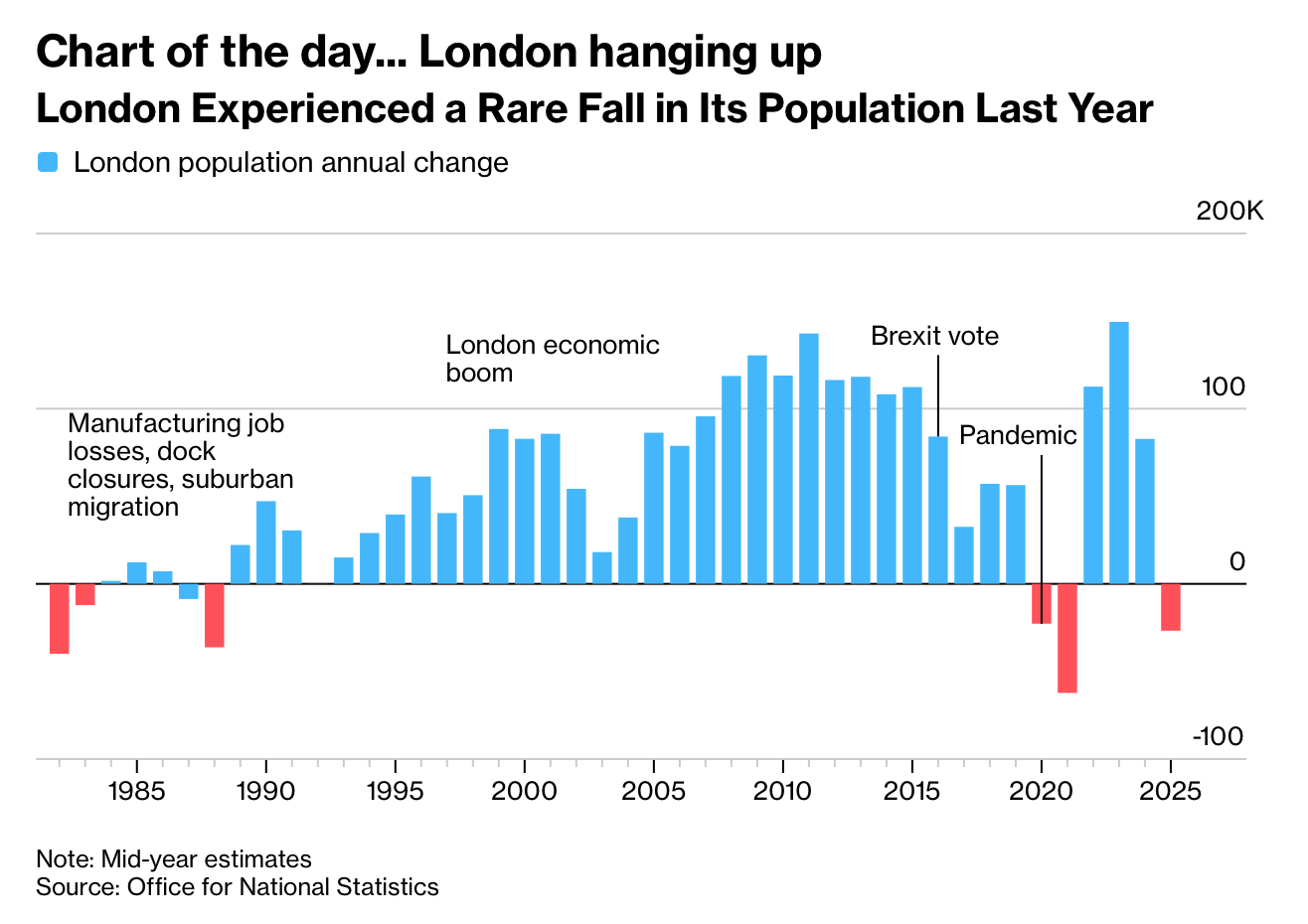
Source: Bloomberg
A smaller London is also not necessarily bad. It could reduce the pressure on housing and transport in the future, but could also erode the tax base, labour pool, school viability and the cultural feel of London. At the moment, this bar represents just a small blip. We’ll have to wait and see if this turns out to be a sustained decline.
Paid subscribers get access to the other four charts: Britain’s transport-investment gap, Europe’s uneven growth, tourism’s new winners and losers, and international iPhone prices. Together, they show how geography converts policy and infrastructure into opportunity and cost.
