
Inflation has hit essentials far harder than everything else
Five charts to start your day


For $10 a month, or $100 a year, you support a simple mission: spread great data visualisation wherever it comes from. You help fund the work of finding, sourcing and explaining the charts that deserve a wider audience. And you back a publication built on generosity, transparency and the belief that better understanding makes a better world.
Inflation is usually discussed as if it were evenly shared. A single number. A common experience. The reality is far messier, and far more uncomfortable.
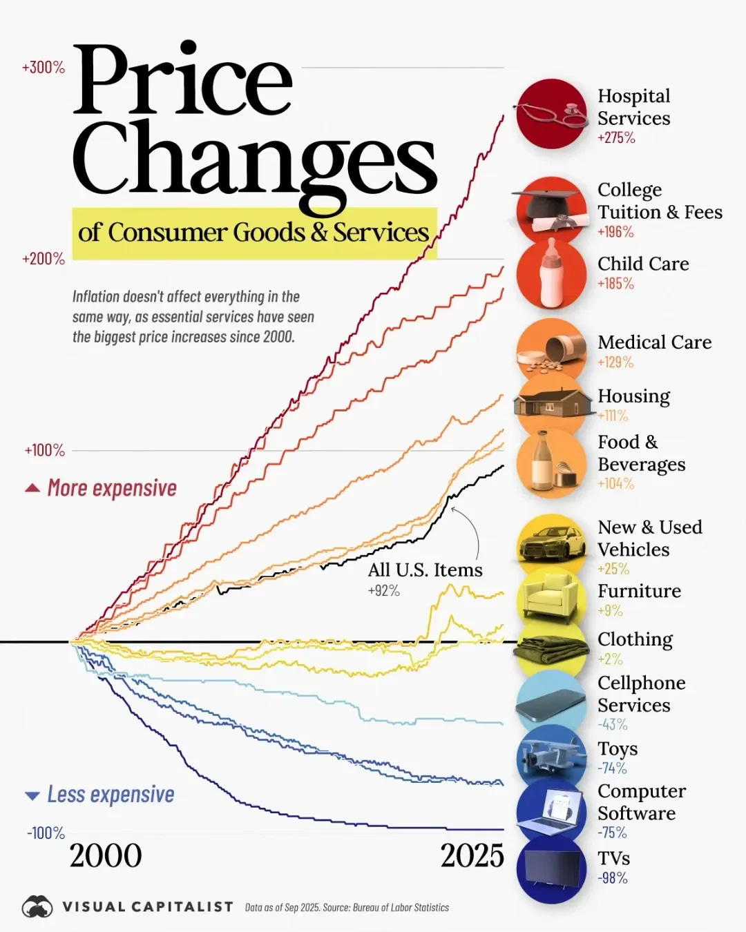
CHART 1 • Inflation has hit essentials far harder than everything else
Inflation is often described as a single number. This chart shows why that is misleading.
Since 2000, prices have not risen evenly across the economy. Essential services have become dramatically more expensive, while many consumer goods have become cheaper. Hospital services, college tuition and child care have seen price increases of well over 150%, far outpacing overall inflation. Housing and medical care have also risen much faster than the headline average.
By contrast, goods exposed to global competition and technological progress have moved in the opposite direction. Electronics, software, toys and televisions are now far cheaper in real terms than they were two decades ago. Productivity gains and international supply chains pushed prices down even as quality improved.
The problem is weighting. Households cannot opt out of healthcare, housing or education in the same way they can delay buying a new television. That means lived inflation feels much higher than official averages suggest, especially for families and lower income households.
Inflation has not been broad-based. It has been concentrated where people have the least flexibility.
Source: Visual Capitalist
One of the quiet dangers in economic data is comfort. Averages reassure. Aggregates smooth away friction. But lived experience rarely moves in straight lines, and it rarely spreads evenly.
I have four more charts that extend this story and explore where these pressures are likely to surface next. They are for paid subscribers. If you want the full edition and the deeper context behind it, consider joining.
