


For $10 a month, or $100 a year, you support a simple mission: spread great data visualisation wherever it comes from. You help fund the work of finding, sourcing and explaining the charts that deserve a wider audience. And you back a publication built on generosity, transparency and the belief that better understanding makes a better world.
CHART 1 • ICE arrests people with no criminal convictions
The news flow has recently gone a bit quiet on ICE arrests, but the trend still continues. Take a look at this chart.
In the past, there was a preference for deporting people who had criminal convictions. Since President Trump came into office, the number of those being deported with violent convictions has remained relatively stable. By contrast, there has been a surge in those being deported without any criminal charges.
What this chart shows is that there has been a significant shift in the way the United States treats immigration.
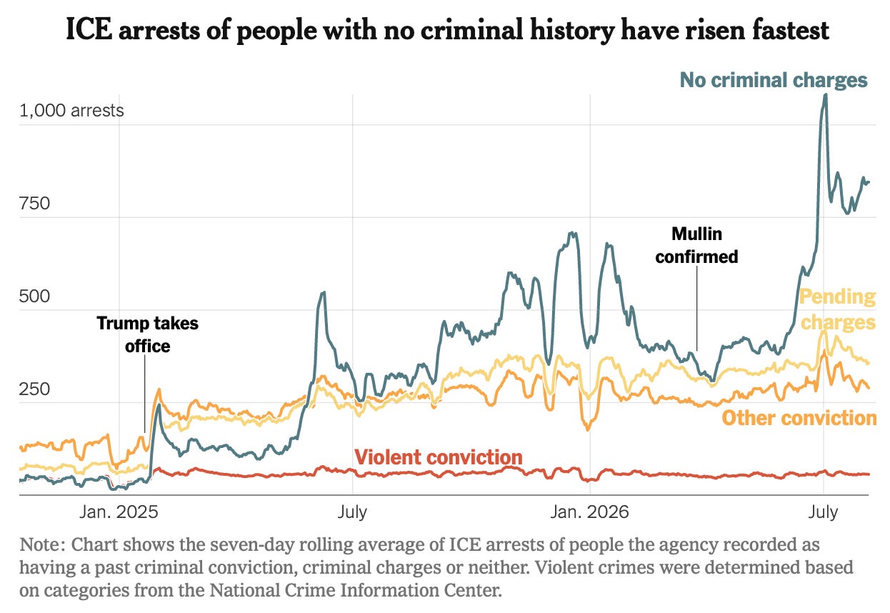
Source: New York Times
The widening gap between those with violent convictions and those with no criminal charges is not driven by preference. It’s driven by the increasing quotas for deporting illegal immigrants, rather than ICE enforcement officers deliberately targeting those without criminal convictions.
The pool of those illegal immigrants without convictions is simply larger than those with convictions, and so that’s why you are seeing an increase in non-conviction arrests. ICE is actively looking for illegal immigrants now to arrest, and most of those people that they find and arrest have no criminal convictions.
Paid subscribers get access to the other four charts: the Senate contest, Europe’s pesticide dispute, Canada–EU trade and the UAE’s African investment promises. Together, they show how institutions turn political ambition into practical leverage.
