
Housing affordability is shifting unevenly
Five charts to start your day


Housing has become the defining economic fault line of our time. For younger generations, owning a home has slipped from expectation to fantasy. What was once a natural milestone in adulthood is now out of reach for all but a lucky few. The culprit is not just rising prices, but the debt-fuelled system that inflated them. Decades of cheap credit pushed property values higher and higher, creating an economy where basic shelter has become a financial burden rather than a foundation.
What shocks me most is how little we talk about the generational divide this has created. The wealth gap that dominates political debates is often framed as rich versus poor, but in reality it is just as much about young versus old. Many of our parents and grandparents bought homes at manageable prices, paid off their mortgages before retiring, and now sit on valuable assets while living debt-free. That financial security has given them options that simply do not exist for younger people today. The only realistic path to home ownership for many is inheritance, which makes the idea of “dreaming big” ring hollow.
This week’s first chart looks at the problem from a different angle. It shows how housing affordability for median earners is shifting unevenly across American cities. Some places have moved back into affordable territory as wages have caught up with rents, while others have slipped further away. What it captures is not just a housing story, but a wage story. When most of your income is swallowed by rent, mobility disappears. People are stuck where they are, unable to build savings or plan for the future.
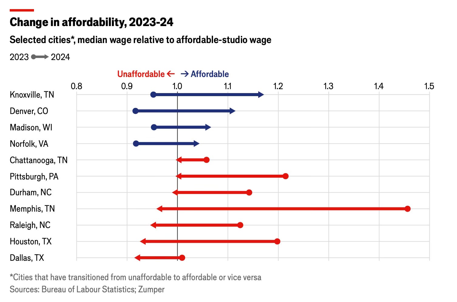
CHART 1 • Housing affordability is shifting unevenly
Across American cities, the ability of median earners to afford basic housing has changed in strikingly different ways over the past year. Some places have moved back into affordable territory, while others have slid out of it.
Knoxville, Denver, Madison and Norfolk all crossed into affordability in 2024, meaning the median wage now exceeds what’s needed to rent a studio at an affordable rate. In Knoxville, the ratio rose to 1.2 times the required wage, the strongest improvement among the cities shown.
By contrast, several southern cities have moved sharply in the other direction. Dallas, Houston, Raleigh, Memphis and Durham all shifted from affordable to unaffordable, with Memphis and Raleigh seeing the steepest declines. These moves reflect a combination of rising rents and stagnating wages, putting basic housing further out of reach for many workers.
The chart captures a growing divergence in local housing markets. Some regions are benefiting from easing rent pressures and wage gains, while others face worsening affordability even for the most modest accommodation.
Source: Economist
This newsletter is not just about housing. I have another few more charts to share with you that are about other topics. But the next chart is about Lisbon and the property crisis that currently engulfed the city.
Landlords have managed to purchase huge swaves of the city and rent out this properties to locals at exorbitant prices relative to wages. I wanted to include this because I wanted to make the point that housing is not just a US problem – it's a global problem across many developed economies.
Have a look at this chart and the others. You will need to be a paid subscriber, however if you want to have access to these. So consider subscribing.
