

For $10 a month, or $100 a year, you support a simple mission: spread great data visualisation wherever it comes from. You help fund the work of finding, sourcing and explaining the charts that deserve a wider audience. And you back a publication built on generosity, transparency and the belief that better understanding makes a better world.
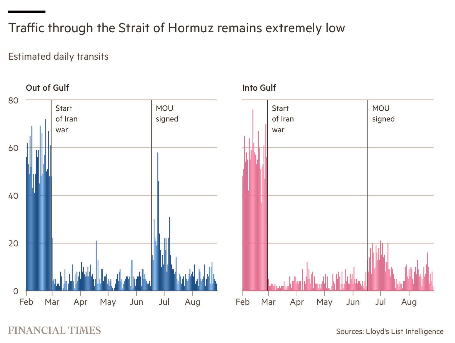
CHART 1 • Hormuz traffic looks more like an escape than a reopening
There was a brief burst of departures through the Strait of Hormuz due to the June US-Iran memorandum. Outbound crossings briefly approached 60 vessels a day, while inbound traffic in the right-hand panel peaked at 20.
However, make no mistake, traffic is still vastly below what occurred before the war (look at both charts). The agreement provided an opportunity for ships to leave, rather than evidence that the Strait was back to business as usual. It was more like a prison breakout from a conflict that is still ongoing.
Source: Financial Times
Now that hostilities have flared up again, traffic has also fallen again. Shipowners, crews, insurers and traders cannot schedule reliable journeys through the Strait and so must wait once again for the next lull in fighting. The reality is that lots of vessels are still trapped in the Strait and those pre-war levels we see in these charts seem unlikely to recover any time soon.
Paid subscribers get access to the other four charts: the countries exposed to Iranian attacks, Europe’s depleted gas stores, Russian gold’s eastern route and the link between electricity and prosperity. Together, they show how security shocks travel through infrastructure and markets.
