

For $10 a month, or $100 a year, you support a simple mission: spread great data visualisation wherever it comes from. You help fund the work of finding, sourcing and explaining the charts that deserve a wider audience. And you back a publication built on generosity, transparency and the belief that better understanding makes a better world.
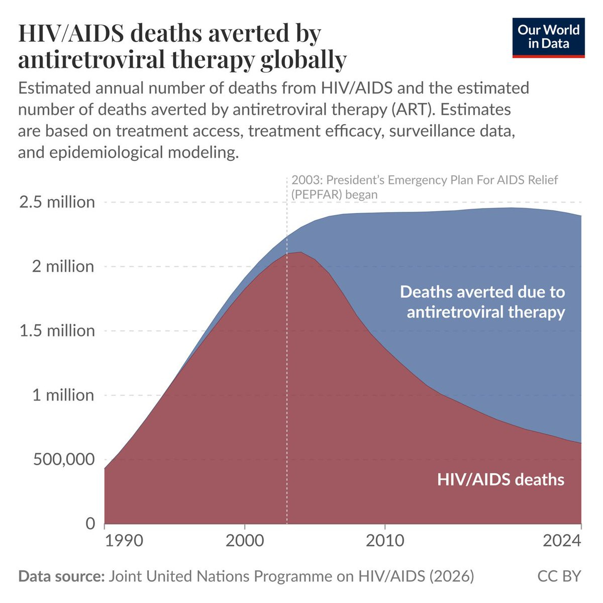
CHART 1 • HIV treatment saves nearly two million
This is probably one of the most significant medical advances in recent times. The development of antiretroviral therapy has changed the lives of HIV patients to such an extent that many of them can now live normal lives and live into old age.
In the past, having HIV was almost considered a death sentence when the pandemic first spread. It was almost a certainty that HIV carriers would eventually die from HIV or AIDS. Nowadays, antiretroviral therapy can suppress the HIV virus so much that carriers can live with almost zero traces of the virus, as the virus is forced to hide away.
Having said that, people are still dying from HIV and AIDS because they lack access to antiretroviral therapy. This is especially the case in poorer countries and certain nations in Africa where access to such healthcare is limited. In theory, nobody should die from HIV or AIDS in this day and age.
Source: Our World in Data
Paid subscribers get access to the other four charts: AIDS mortality in Africa, Brazil’s health priorities, the decline in extreme poverty and American commuting. Together, they show how broad measures of progress meet the daily conditions that determine who benefits.
