
Half of global CO2 came from these 36 companies
Five charts to start your day


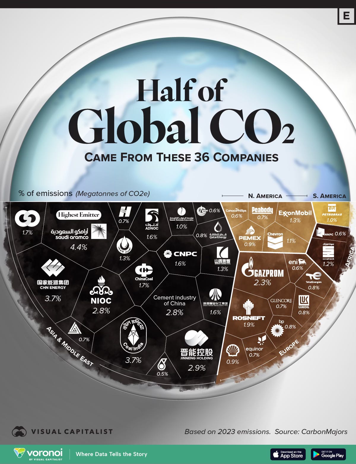
For $10 a month, or $100 a year, you support a simple mission: spread great data visualisation wherever it comes from. You help fund the work of finding, sourcing and explaining the charts that deserve a wider audience. And you back a publication built on generosity, transparency and the belief that better understanding makes a better world.CHART 1 • Half of global CO2 came from these 36 companies
For much of the climate debate, emissions have been framed as a national problem. Countries set targets. Countries sign treaties. Countries report progress to the UN.
This chart reframes it.
According to CarbonMajors data for 2023, half of all global CO2 emissions can be traced back to thirty-six companies. Saudi Aramco alone accounts for 4.4%. Coal India and CHN Energy each contribute 3.7%. NIOC, Iran’s national oil company, 2.8%. The Cement Industry of China, another 2.8%.
The list is dominated by state-owned enterprises. Aramco, NIOC, CNPC, Gazprom, Rosneft. These are not companies that answer to activist shareholders or net zero pledges. They are instruments of national energy policy, and their governments have little incentive to shrink them.
The Western majors are present but not dominant. ExxonMobil at 1.3%. Chevron at 1.1%. BP, Shell, TotalEnergies each below 1%. Combined they are a fraction of what the state-owned producers contribute.
This matters for how we think about climate policy. The conversation in most Western democracies focuses on corporate disclosure, carbon pricing and consumer behaviour. Those levers barely reach the entities at the top of this chart. Gazprom does not file a TCFD report. Coal India is not preparing a transition plan for institutional investors.
Source: Visual Capitalist
The centre of gravity in emissions does not sit in Western boardrooms but inside national oil and coal champions whose incentives are geopolitical before they are environmental. That alone reshapes how we think about climate accountability.
We are moving from a world organised around efficiency to one organised around resilience. That sounds sensible. It is also expensive. The question is who ultimately pays and how markets reprice that reality.
I have four more charts that dig further into this realignment and what it could mean for investors over the next decade. They are in the paid edition. Consider joining if you want the full analysis and the complete set of charts.
