


For $10 a month, or $100 a year, you support a simple mission: spread great data visualisation wherever it comes from. You help fund the work of finding, sourcing and explaining the charts that deserve a wider audience. And you back a publication built on generosity, transparency and the belief that better understanding makes a better world.
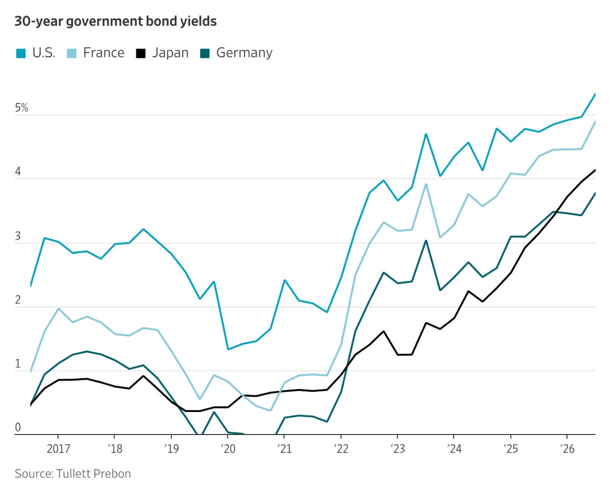
CHART 1 • Governments face rising 30-year borrowing costs
Take a look at this chart and you can see what the issue is: long-term bond yields are rising across these four countries, which means that investors are demanding considerably more to lend governments money for 30 years.
Part of this reflects expectations that inflation and interest rates will remain higher than they have been since the ultra-low rate era that has persisted up until now. However, this rise also reflects higher expected real interest rates, increased government borrowing, and a greater premium for the uncertainty involved in holding long-term debt.
Source: Wall Street Journal
What this chart tells us is that investors are no longer willing to finance governments for decades at extraordinarily low rates that they once accepted. For heavily indebted governments, this creates a problem. As existing debt matures and is refinanced at higher rates, interest costs rise and consume a larger share of government revenue. That leaves less room for spending elsewhere and can force governments to raise taxes or borrow even more.
Higher government bond yields can also feed through into mortgages and corporate borrowing costs, making capital more expensive across the economy.
Paid subscribers get access to the other four charts: French and Italian borrowing, the Bank of England’s balance sheet, Russia’s gold buffer and Ukraine’s bonds. Together, they show how fiscal credibility, reserves and political expectations set the price of sovereignty.
