
Global conflict is on the rise again
Five charts to start your day


For $10 a month, or $100 a year, you support a simple mission: spread great data visualisation wherever it comes from. You help fund the work of finding, sourcing and explaining the charts that deserve a wider audience. And you back a publication built on generosity, transparency and the belief that better understanding makes a better world.CHART 1 • Global conflict is on the rise again
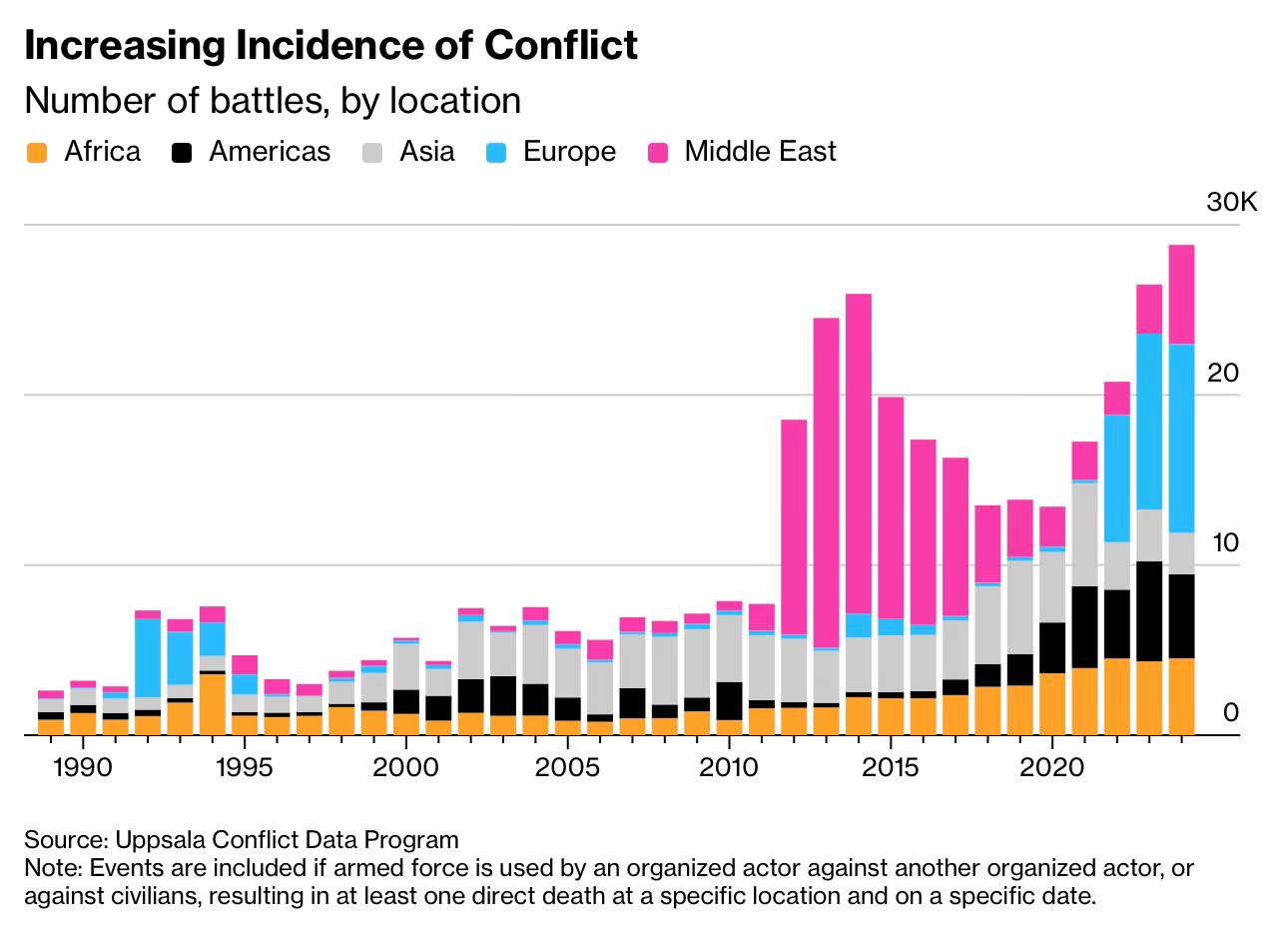
It is easy to think of war as something that breaks out in isolated places yet this chart shows a much wider shift. The number of recorded battles worldwide has climbed sharply over the past decade and it is now at levels not seen since reliable data began. That makes this more than a regional crisis. It is a global trend.
The picture has changed dramatically since the early 1990s when battle events remained comparatively low. The first major spike came in the early 2010s as conflicts in Syria, Iraq and Yemen pushed Middle Eastern fighting to unprecedented levels. After that surge the numbers fell a little but never returned to anything like the earlier baseline. Instead the rise spread outwards. Africa shows a steep increase as armed groups multiply across the Sahel, the Horn and central Africa. Asia also continues to climb with conflicts in Myanmar and Afghanistan contributing to the trend. Even Europe which sat near zero for decades shows a clear jump after Russia invaded Ukraine, pushing the continent’s share of global conflict to heights not seen in the post Cold War era.
The shift is structural. Conflicts are more fragmented, more regionalised and often driven by non state actors which makes them harder to resolve. The chart also shows that the decline of the Middle East spike did not bring global numbers down. Other regions simply rose to take its place. That is kind of depressing.
Source: Bloomberg
All five charts today point to a world that is changing in several directions at once. Rising conflict, vast investment in AI hardware, weakening oil markets, uneven consumer strength and expanding non degree opportunities all speak to an economy in transition. It is not a single story. It is a set of competing forces that reveal how fragile and adaptable the global system has become.
This means I have four more charts that build on this theme and deepen the picture. They are for paid subscribers. Consider joining if you want the full edition and the extra analysis that comes with it.
