

For $10 a month, or $100 a year, you support a simple mission: spread great data visualisation wherever it comes from. You help fund the work of finding, sourcing and explaining the charts that deserve a wider audience. And you back a publication built on generosity, transparency and the belief that better understanding makes a better world.
CHART 1 • Gasoline prices go through the roof
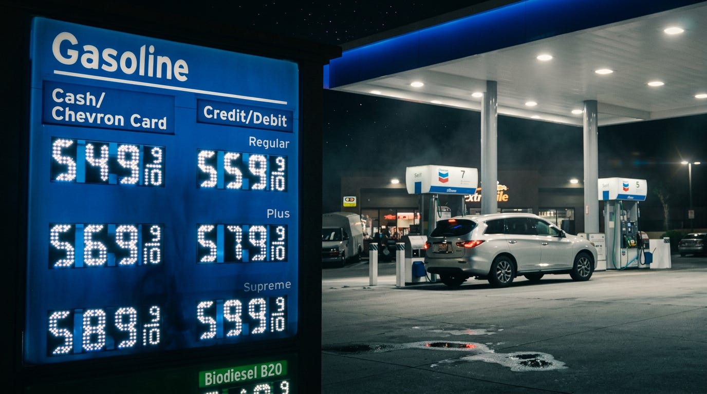
We know that inflation has returned, and it is here to stay. But what really stands out when you look at this chart is the energy bar, which is driven strongly by gasoline prices. Year on year, gasoline prices in the United States have risen by 27.4%, which is an incredible increase.
Of course, much of this has been driven by recent events, especially the war in Iran which started in February 2026. The issue is that this has happened just before the start of the midterm elections. We know that voters in the United States are not happy about the rising cost of fuel. This could therefore have serious repercussions for the outcome of these elections.
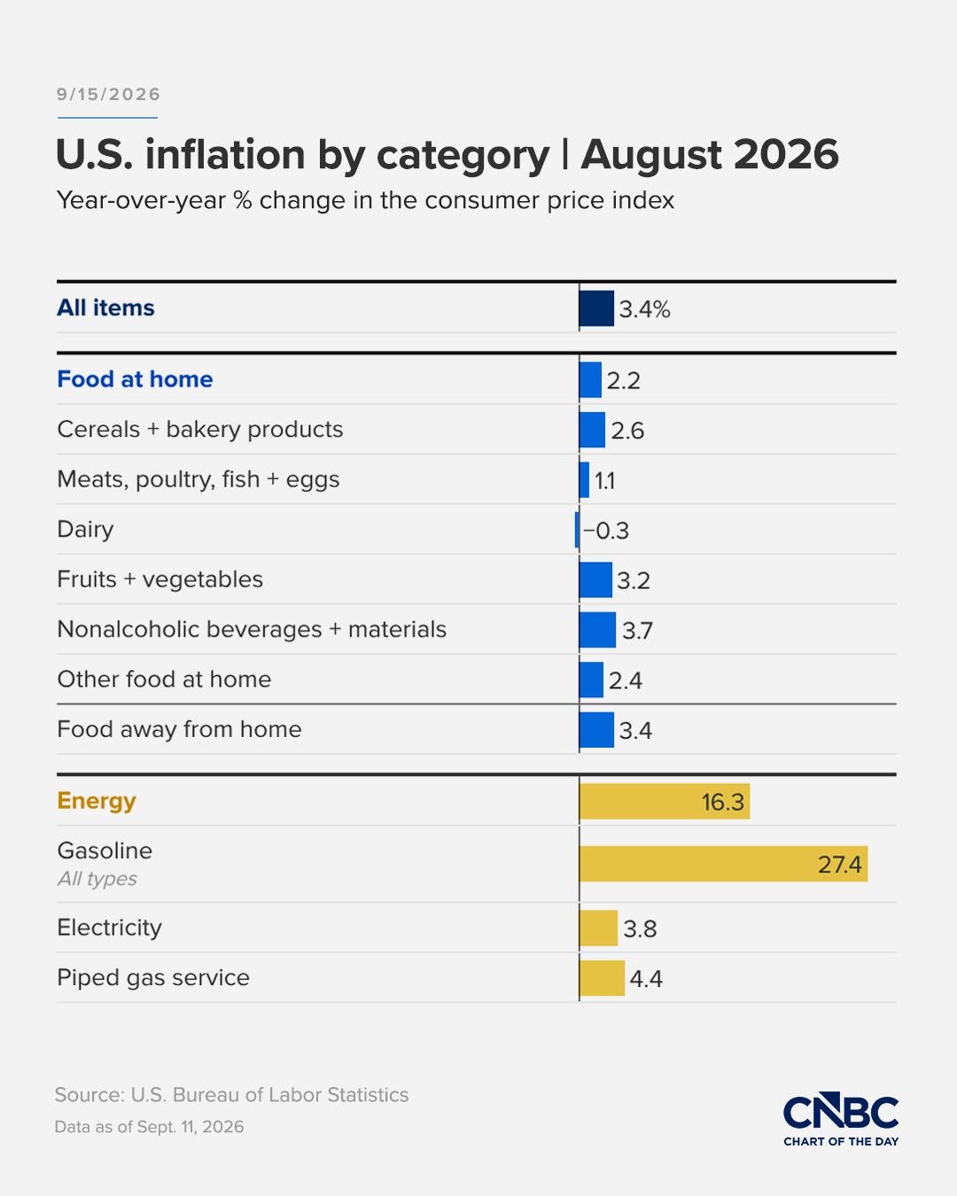
Source: CNBC
Everything else, as you can see, feels moderate to slightly high, yet acceptable. However, that could change in the months ahead.
Diesel prices have now surpassed $6 per gallon, and this could have a significant impact on how this chart looks in the months ahead. Diesel is used to power agricultural machinery, so we could start to see an increase in food inflation, further increasing the cost of living for Americans.
Paid subscribers get access to the other four charts: fractured rate cuts, exceptional central-bank balance sheets, Britain’s fiscal gap and Nigeria’s record reduction. Together, they show why the path back to easier money is no longer shared.
