
FTSE 100 finally has a year worth noticing
Five charts to start your day


For $10 a month, or $100 a year, you support a simple mission: spread great data visualisation wherever it comes from. You help fund the work of finding, sourcing and explaining the charts that deserve a wider audience. And you back a publication built on generosity, transparency and the belief that better understanding makes a better world.CHART 1 • FTSE 100 finally has a year worth noticing
For years the FTSE 100 has been the market people apologise for owning. Too heavy in energy and banks. Too light on tech. Too UK in sentiment, even when the underlying revenues are global. This chart shows why that lazy view can blow up quickly.
The FTSE 100 ended 2025 up 21.51%, its strongest annual performance since 2009. That matters because it was not built on a single fashionable theme or on multiple expansion. It was built on the index’s structure and on earnings. A large share of FTSE revenues come from overseas, so sterling moves matter. The sector mix matters too. Higher rates tend to help banks. Commodity strength tends to help energy and miners. When inflation risk refuses to die, cash flows and dividends start looking less boring.
The deeper story is rotation. The last decade rewarded long duration growth and the US dominated that trade. As the price of capital rose and real rates stayed positive, leadership broadened and the markets that looked dull started to look better positioned.
Is 2025 just a one off catch up year or the start of a longer rerating for UK equities driven by valuation and cash flow discipline?
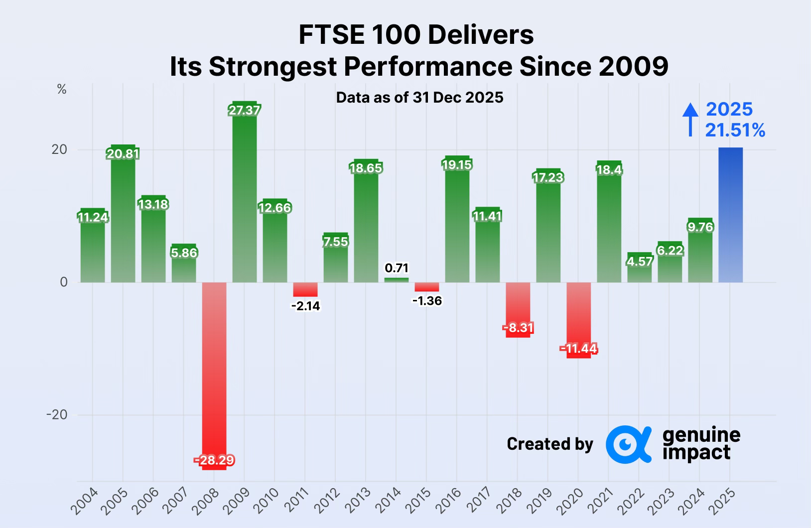
Source: Genuine Impact
good year for an unfashionable index usually reflects how it was positioned, not a sudden improvement in quality. The same is true elsewhere. Housing adjusts instead of resetting. Mining consolidates because new supply is hard. Drug economics hinge on where pricing power is allowed. Commodities outperform because they rely on fewer assumptions.
That matters because markets reward structure before they reward stories. When the environment shifts, the places that looked boring can suddenly matter a great deal.
I have four more charts that extend this story and explore where these dynamics are most likely to surprise next. They are for paid subscribers. Consider joining if you want the full edition.
