
Five charts to start your day

There’s been a splurge of charts and data visualisations on the internet recently. It’s hard to keep up. It’s even hard to whittle these down to my top five for today. But here they are. These were the most memorable
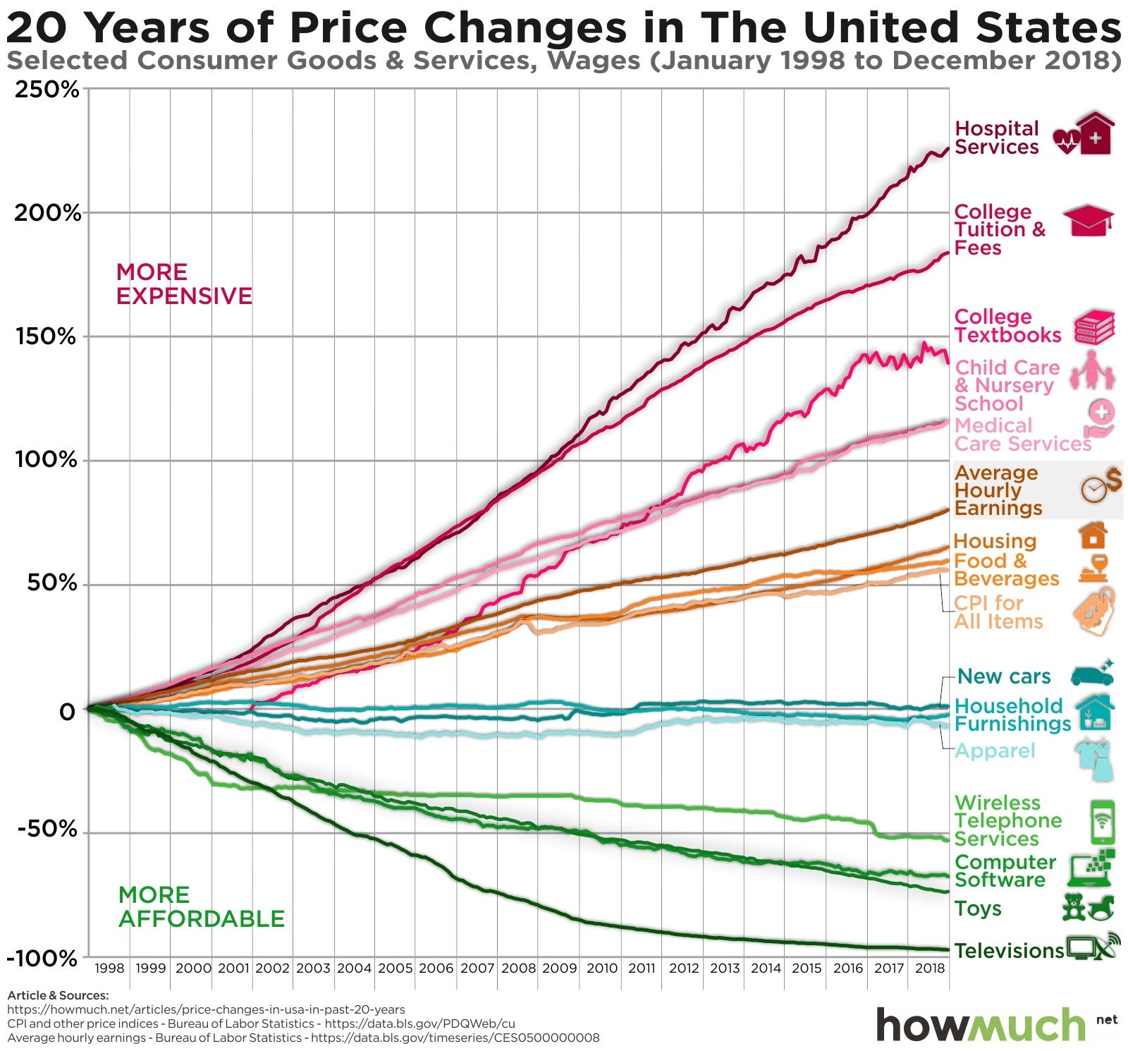
US inflation broken down into its individual parts. I think for most Americans, these results will be unsurprising.
Data visualisation of the most profitable companies by sector
An EEAGLI piece released yesterday. Watch the animated version here.
This set to be the hottest year since 1979
The world’s most congested cities
Right, let’s get started!
Breaking down the components of the US CPI to see how individual items and services rose in price since 1998
Source: howmuch, https://howmuch.net/articles/price-changes-in-usa-in-past-20-years
