Five charts to start your day
There are two ways to look at population growth and both might lead you to different conclusions.
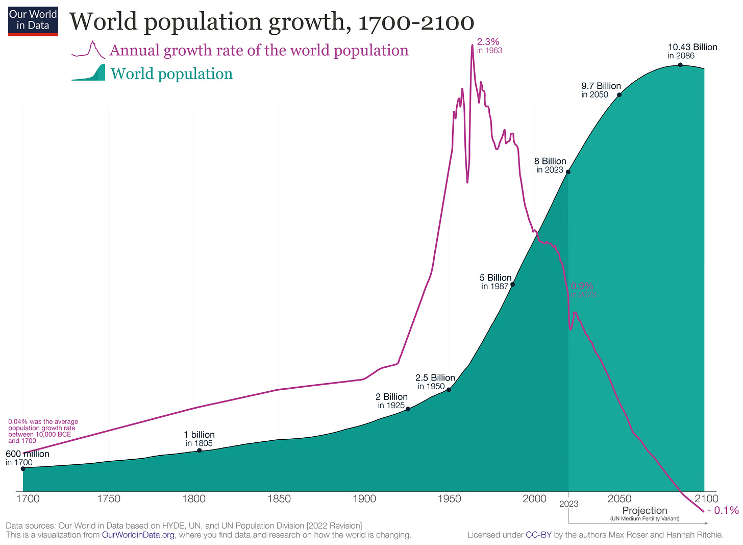
Is the world overpopulated? There are two ways to look at population growth, and both might lead you to different conclusions. If you don't believe me, take a look at this chart below.
It completely changes your perspective, depending on the dataset you examine. On the one hand, there's population growth, which peaked at 2.3% in 1963 and has since declined. This trend began 50 years ago, meaning we've had half a century to adapt to this change. Moreover, by the end of the century, this growth rate is projected to turn negative, indicating a decline in the global population.
Now, if you turn your attention to the other dataset, which shows the cumulative number of people on this planet, you'll see that it peaks at 10.43 billion people in 2086. The world's population gradually increases until it reaches this peak.
Another question I have for you is: which dataset appears more alarming at first glance? Both datasets are accurate, but they elicit very different feelings and emotions upon initially viewing.
We tend to think of data as a form of scientific certainty that our human brains can comprehend. However, the way data are presented can frame our thoughts and alter our perception of a problem.
Source: Our World in Data
Coming up:
Latin America is home to 75% of the world’s Spanish speakers?
BYD has overtaken Tesla on sales, but not market capitalisation
New year resolutions in the United States
Former popular names that died off
If you like what you see here, and you would like to view the other four charts, consider becoming a paid subscriber. It costs less than two cups of coffee for a whole month’s access.


